The Problem
Budtenders dont have a way to see these recommendations. They now face challenges in managing customer interactions effectively and ensuring consistent product recommendations with FloraAI.
Budtenders need a streamlined platform to enhance their efficiency and knowledge, resulting in improved customer satisfaction and confidence in the products recommended to them.
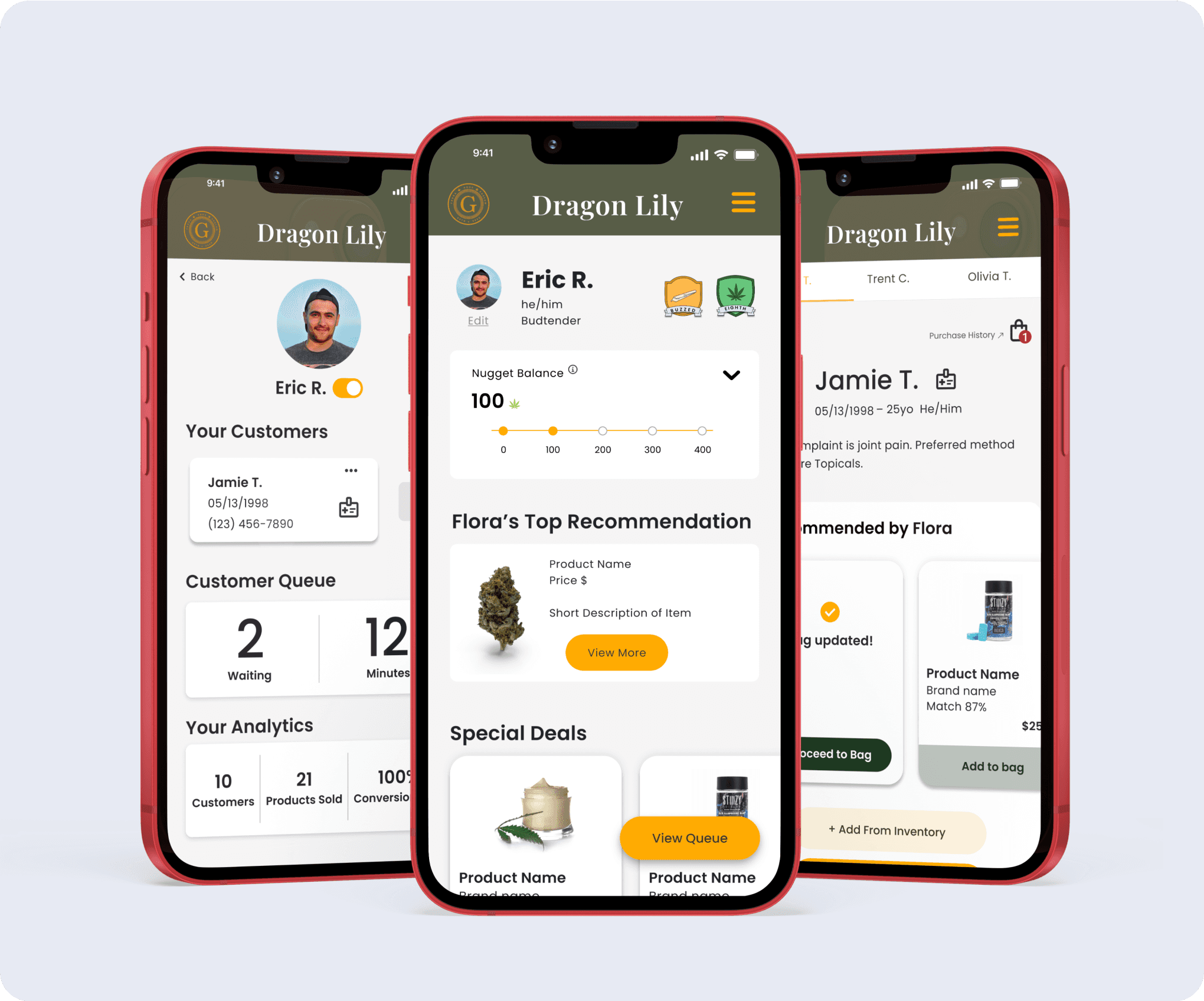
Designed from scratch to address the specific pain points of budtenders.
Approach
UX Methodologies utilized:
User Research – interviews, surveys, usability testing
Affinity Mapping
Personas
User journeys
User Flows
Wireframing and prototyping
User testing and feedback
Iterative design
Feature prioritization
Design Toolkit
Figma

Trello
Notion

G Suite
My Role
As a UX designer within the team, I served the role of team lead, ensuring our project stayed on course and leading our meetings effectively. Additionally, I spearheaded the UX research efforts for the project.
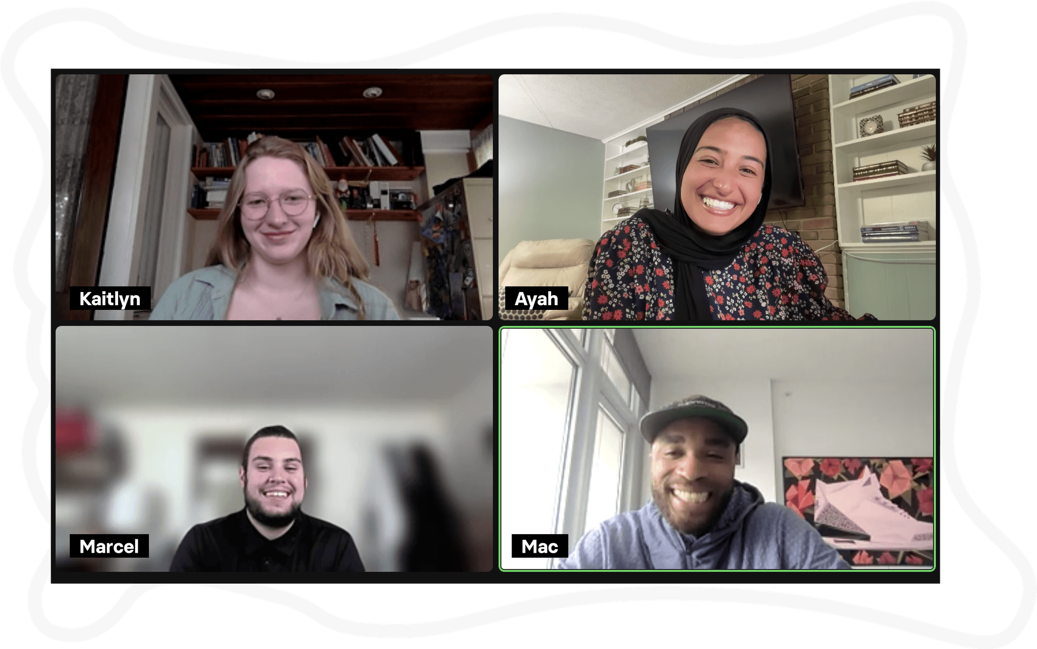
Meet the Team
Design Process
Discover
The journey commenced with a thorough comprehension of the business objectives and a strong alignment with their mission. This stage involved mutiple stakeholder meetings, immersing ourselves in the cannabis industry by studying existing articles and books.
We conducted comprehensive user interviews with budtenders to understand pain points, preferences, and workflow requirements.
We also sought to understand the mind of the customer by surveying dispensary shoppers to preemptively address their frustrations through our employee portal.
Define
After analyzing and synthesizing our research, we embarked on the creation of Eric, our primary user persona. We defined Eric's problem statement which also helped us define our feature prioritizations to create his MVP portal. Fueled by probing "How Might We" (HMW) statements, and visualizing his journey map and user flows to outline the course of our intervention.
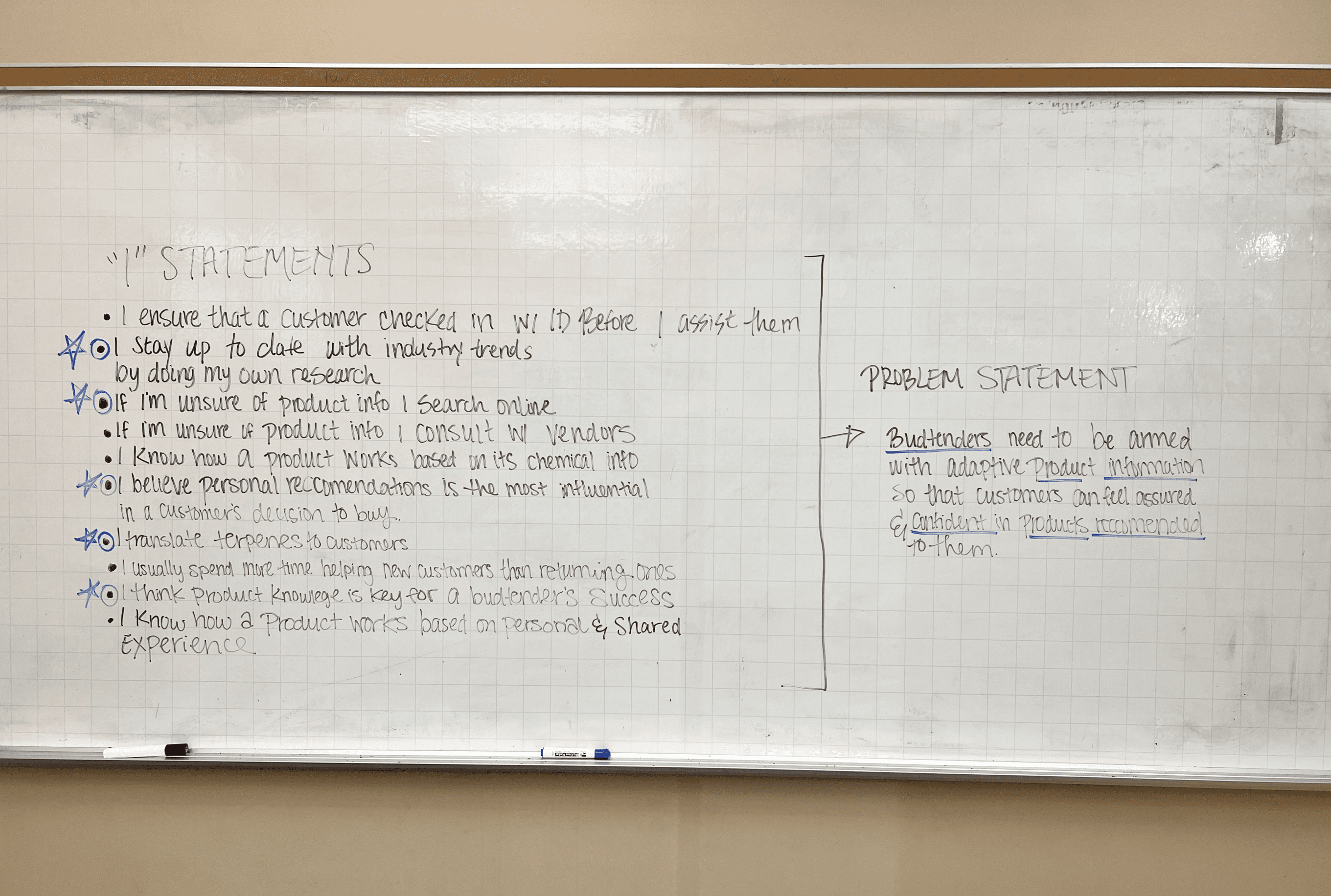
In this phase we worked as a team to define the problem statement from a list of “I Statements”
Develop
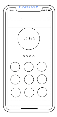
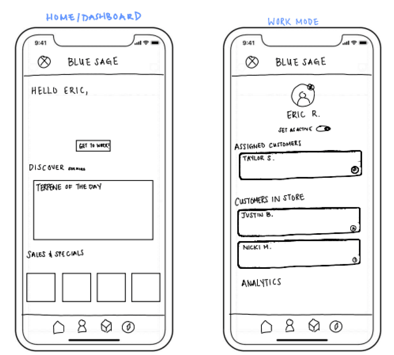
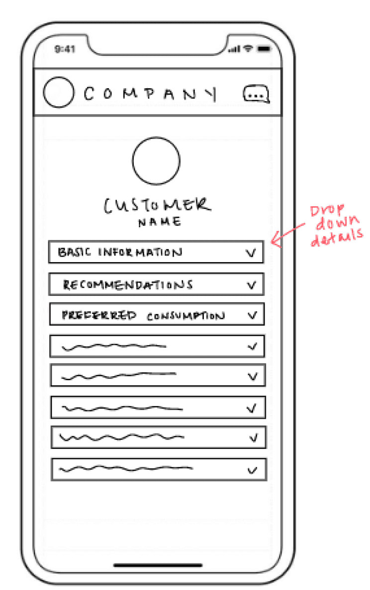
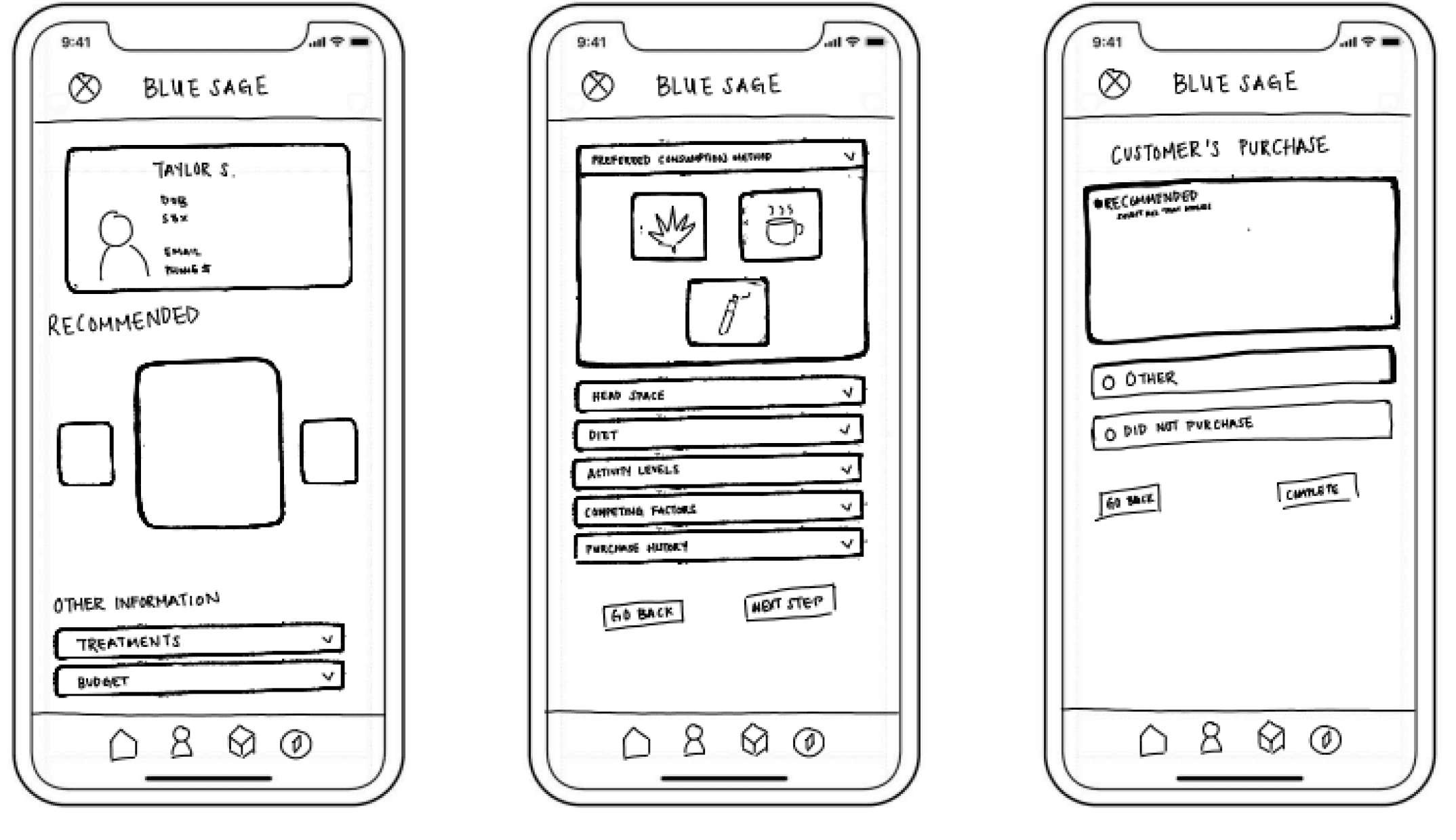
Moving into production mode, we began sketching and designing low-fidelity iterations of the interface, taking into account research-based feature prioritizations feedback from stakeholders and senior design peers. We also conducted usability tests with budtenders, gathering feedback, and iterating on our designs.
Deliver
In the final stage, we brought our vision to life through refining our ideas into a high fidelity interactive prototype. We prepared comprehensive design documentation for a seamless handoff.
Research Methods
User Interviews
Our Target Audience
To fully understand the user we’re designing for we set out to specifically interview budtenders. We recruited budtenders from dispensaries who are clients of Genetica, as well as budtenders from diverse shops unrelated to Genetica.
This comprehensive approach was strategically adopted to not only gain insights into the distinct workflow within the Genetica model, as to enhance the flow that includes the customer intake form, but also to uncover the shared goals and frustrations inherent among all budtenders.
We conducted 7 interviews:
3 budtenders from Blue Sage (Genetica client)
2 budtenders from Dragon Lily (Genetica client)
2 budtenders from non-Genetica associated dispensaries
Affinity Mapping
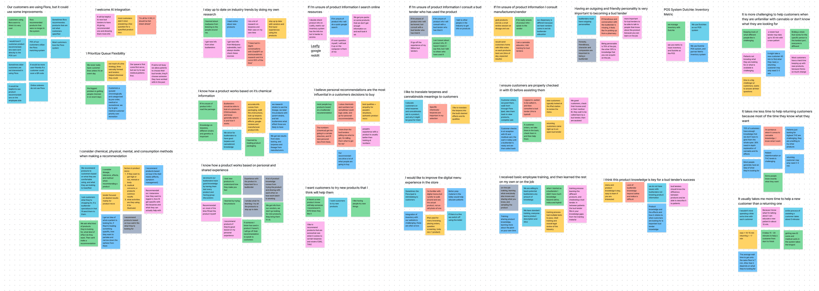
To make sense of the qualitative data and insights gathered during our user interviews, we created an affinity map. This is a visual tool that categorizes and clusters key insights and quotes gathered from interviews, providing a holistic view of user perspectives and aiding in the identification of common themes and pain points.
Prioritizing “I Statement”s
In each cluster of the map, we distilled the key takeaway with a simple "I Statement". These statements helped us understand the interview data better and guided us as we moved forward in our design process.
From a pool of 22 "I Statement"s, we strategically honed in on the top 4 that encapsulated the most prominent themes and priorities within our user interviews.
Top 4 “I Statement”s
Interview Takeaways
Budtenders believe that personalized product recommendations have a significant impact on a customer's purchasing decisions. This highlights the pivotal role of budtenders in guiding customers towards products that align with their individual preferences and needs.
Product knowledge is essential
Budtenders acknowledge that a strong foundation of product knowledge is pivotal to their success in assisting customers effectively. This underscores the importance of ongoing education and training in the cannabis industry to empower budtenders to provide valuable assistance.
Efficient queue management is crucial
Queue management practices vary, with an emphasis on prioritizing medical patients when possible and allowing customers to choose preferred budtenders. Days with scheduled events present unique challenges in handling customer flow.
There's a strong belief that AI can significantly aid new budtenders by offering recommendations and delivering additional product information. This highlights a desire for technology to enhance the budtender-customer relationship.
Designing for a Two-Sided Market
While this doesn't fit the traditional definition of a two-sided market (which usually involves connecting two distinct user groups like buyers and sellers), Genetica still involves 2 sides to consider and design for in order for the product to function:
1.
Budtenders
Budtenders at the dispensaries will use Genetica's employee portal, which assists them in providing the customer recommendations based on the data from the customer intake forms.
2.
Customers
Customers who visit the dispensaries using Genetica's technology complete the customer intake form, which captures their preferences and needs. This information is used to provide personalized recommendations.
One function can not stand on its own. The user journey of each side will fail without the involvement of the other. Without the portal, employees hover over the customer’s shoulder while they complete the intake form so that they can see what Flora, the AI, recommends to them. Similarly, without the intake forms the employee portal would not have the necessary data to complete the employee user flow. That being said, to create a well rounded employee portal,
to the team about why I believed understanding the customer’s journey while shopping at the dispensary was just as crucial as understanding the budtenders. As a result, they agreed to my idea to create a survey.
Customer Surveys
Why survey customers if we’re designing for the employee? 🤔
Understanding customer needs and preferences can help us design an interface that better serves those needs.
Surveying customers can help identify pain points in the shopping experience that employees may need to address.
By understanding what customers value most about the dispensary, you can help employees prioritize their work accordingly.
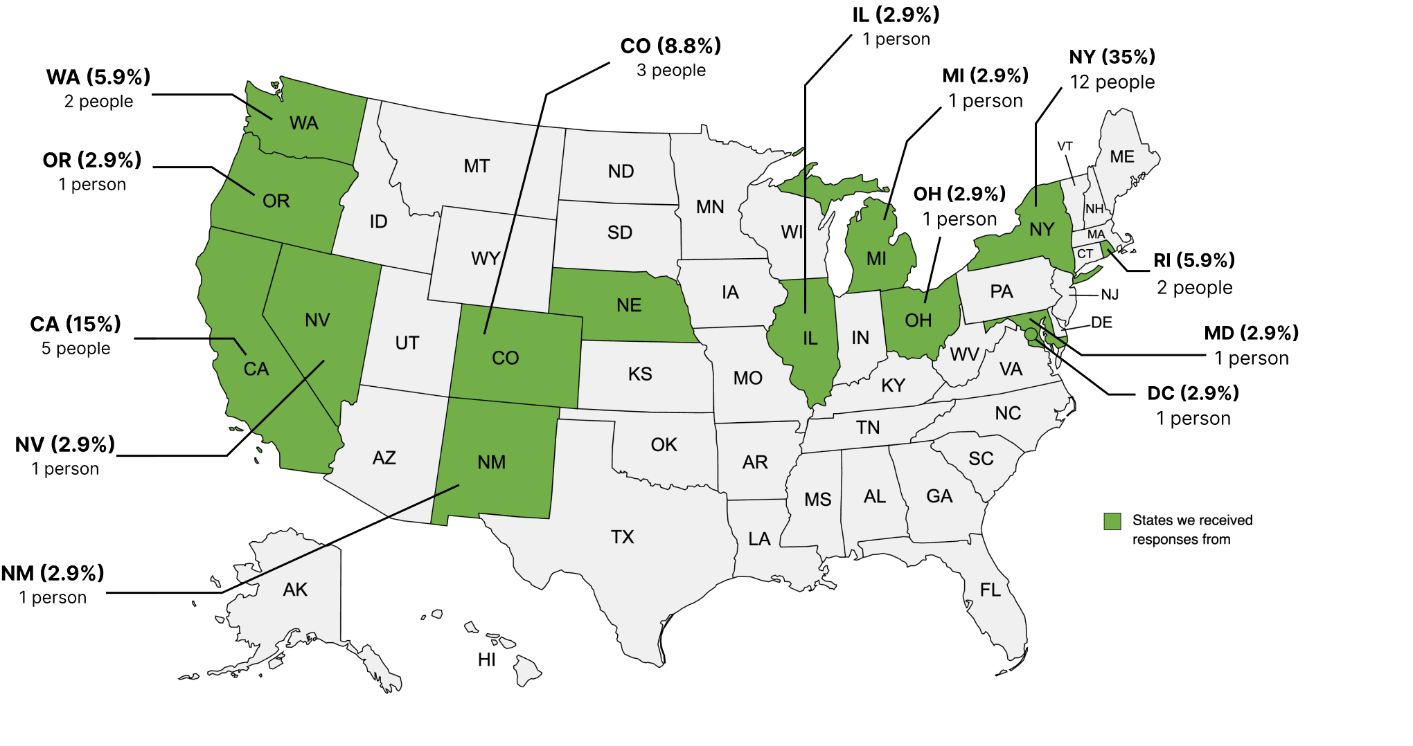
Demographics of Participants
34 participants | 25 people (18 – 34 years) | 9 people (35 – 54 years)
Results and Key Takeaways
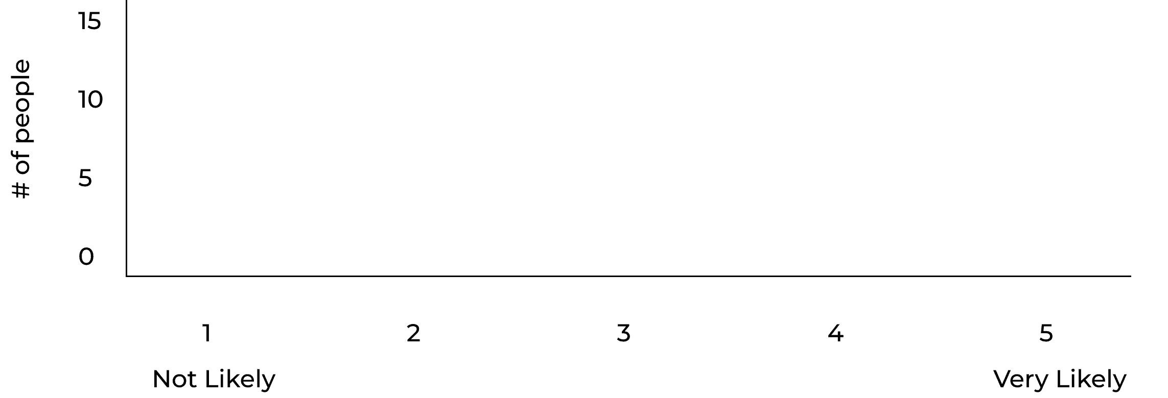
How likely are you to try different products?

Key Takeaway:
70% of respondents say that they are likely to try new products. (selected 4 or 5)
Given Genetica's utilization of Flora AI to match customers with products, this insight indicates a favorable disposition towards product suggestions and potential purchases.
How likely are you to take recommendations from a dispensary employee?

Key Takeaway:
100% of respondents voted a 3 or higher for taking recommendations from a dispensary employee.
Genetica tasked us with designing a system for budtenders to recommend products suggested by Flora to customers. This initiative could have been futile if we discovered that customers were hesitant to accept recommendations from employees, akin to experiences with salespeople in dealerships and retail stores. To our gratification, this was not the case. This insight suggests that our designs could have a great product market fit and validated us to move forward.
Meet the User
Primary Persona
Eric (he/him) – The “Terpene King”
Eric self describes as the Terpene King. He takes pride in his cannabis knowledge and is always trying to learn more by reading online forums and doing his own research. He loves to look a the terpenes and lineage of each product and translate that into real body effects for his customers.
🎯
Goals
Eric's primary goals include tailoring the best product recommendations for each customer to ensure their satisfaction. To achieve this, he aims to continuously enhance his knowledge and expertise in cannabis and terpenes, enabling him to provide accurate and reliable information.
Attitudes
Patient and empathetic when dealing with customers who may be anxious or uncertain about cannabis use
Behaviors
Swaps knowledge with other budtenders
Constantly doing his own online research
Uses terpene, cannabinoid, and strain lineage to determine a products uses and effects
📱
Eric’s Problem
❗️
Eric needs to be armed with adaptive product information so that customers can feel assured and confident in the products recommended to them.
How Might We...
🤔
HMW empower bud tenders with a seamless tool to identify and prioritize customer needs so that they can instill trust, increase transaction size, and retain customer loyalty
Iterations and Validation
User Flow
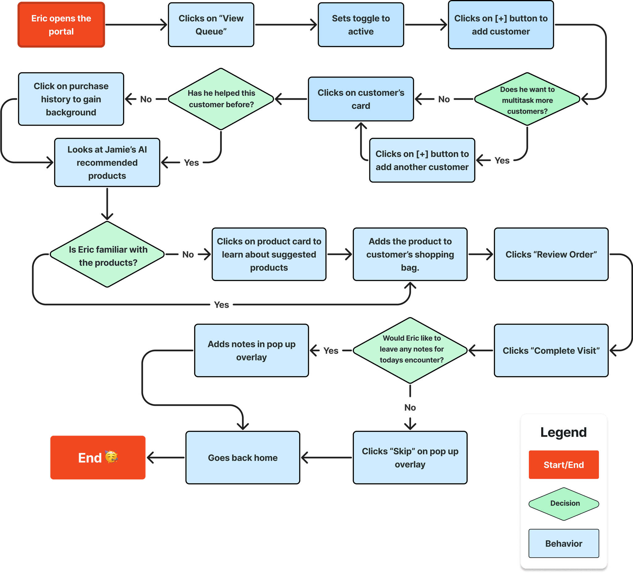
At the onset of our design phase, we made sure to have a clear understanding of the user flow in order to deliberately sketch our design concepts.
Eric helping a customer purchase a product
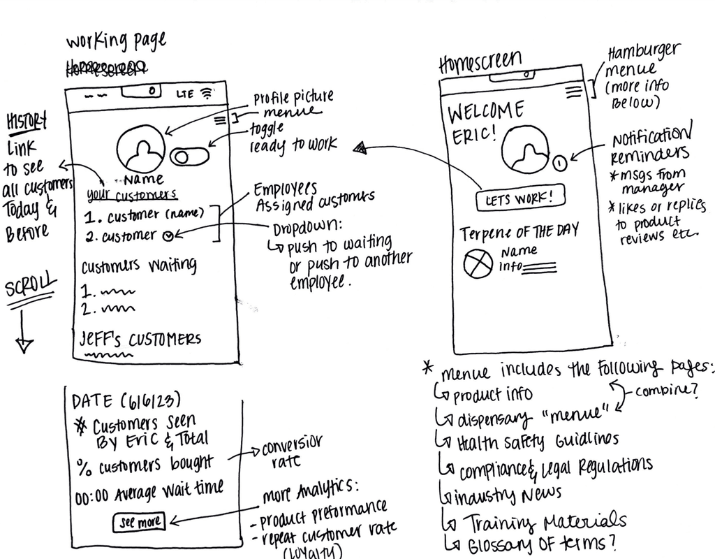
Sketch Studio
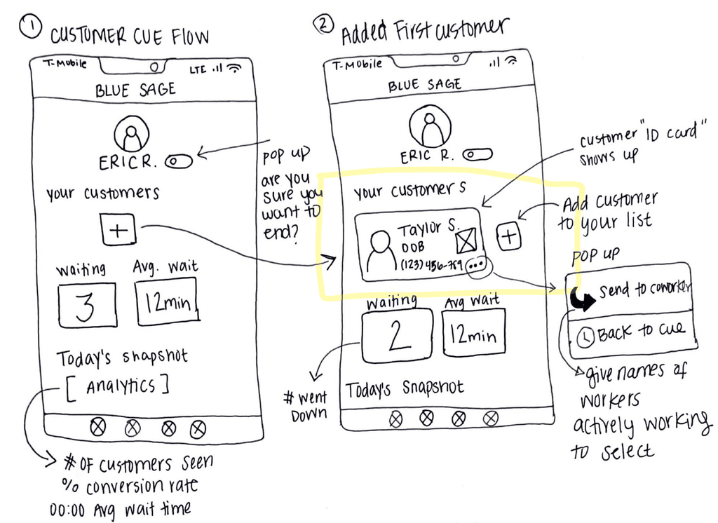
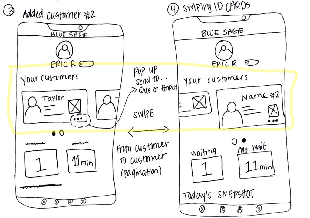
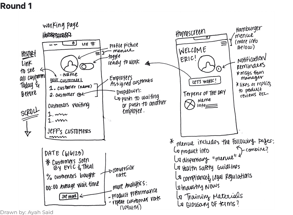
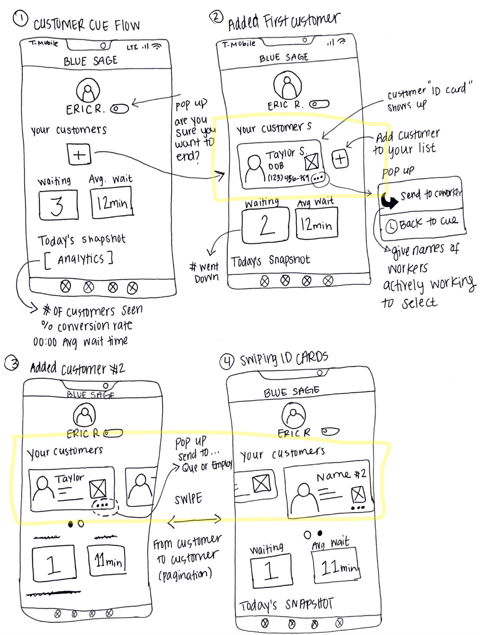
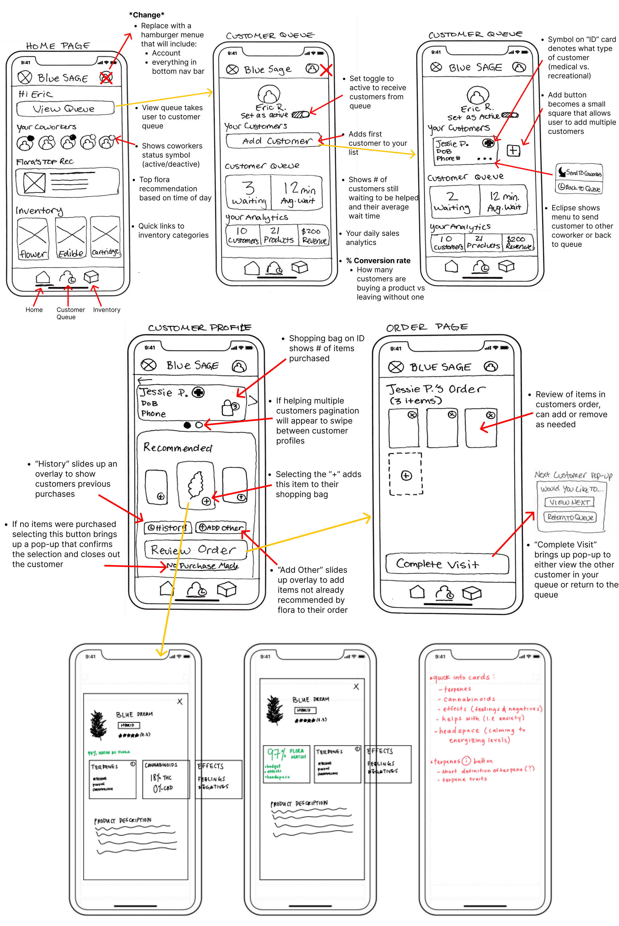
Before moving into wireframing we first held a design studio. This way we can get a better understanding of how everyone on the team envisioned the portal and the changes we would want to make.
I moderated and lead our sketch studios as each person presented their sketches. As a team, we highlighted the features we wanted to make sure moves on to our final sketch.
We completed 4 rounds of sketches, creating more than 20 different iterations.
Swipe to Explore Initial Sketches:
Round 4 - Final Sketch
Drawn by: Kaitlyn Peterson
Usability Testing Mid-Fidelity
5 participants | 11 tasks | Remote
As we completed our mid-fidelity wireframes we sought validation in 2 ways:
Internally by holding multiple design critique sessions with senior designers
Externally by inviting participants who represented our target audience to usability testing.
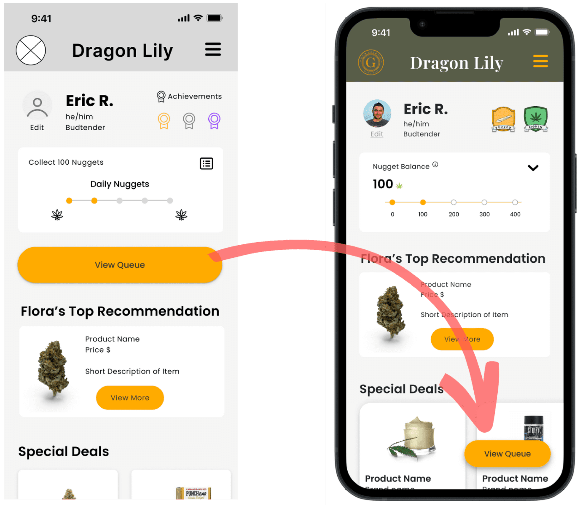
100% Overlooked “View Queue” Button
When users were tasked with locating the customer queue, everyone consistently overlooked the button originally placed on the home screen, instead opting to access it through the hamburger menu
Recognizing the pivotal role of this feature as a primary call to action, we strategically relocated the 'View Queue' button to a fixed position in the bottom right-hand corner of the interface.
Mid-Fidelity
High Fidelity
💡
UX Reasoning – Bottom Right Placement of CTA
Left button
Right button
Slower
Faster
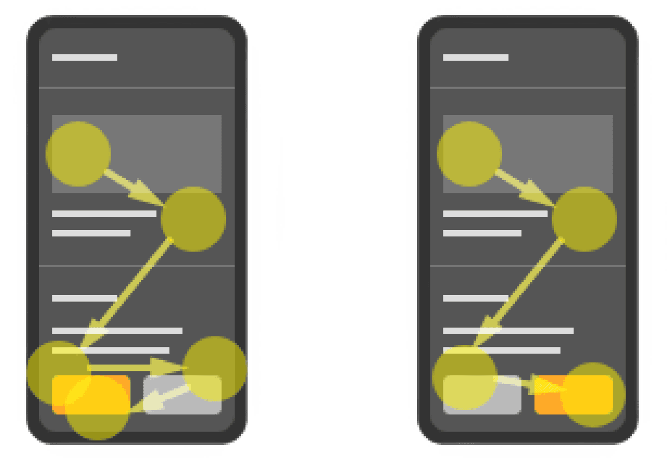
When the primary action is on the left, it works against reading gravity. The user’s eyes want to move toward the bottom right, but the visual weight of the button keeps them fixated on the bottom left. After the fixation, they move to the bottom right only to revert to the left to tap the main button. As a result, the user’s eyes sweep back and forth sweep, increasing the user’s task time.
When the primary action is on the right, the result is faster task completion because the button is where the reading gravity ends. Users don’t have to reverse their scanning flow or fixate on the primary action more than once.
Comparative Analysis:
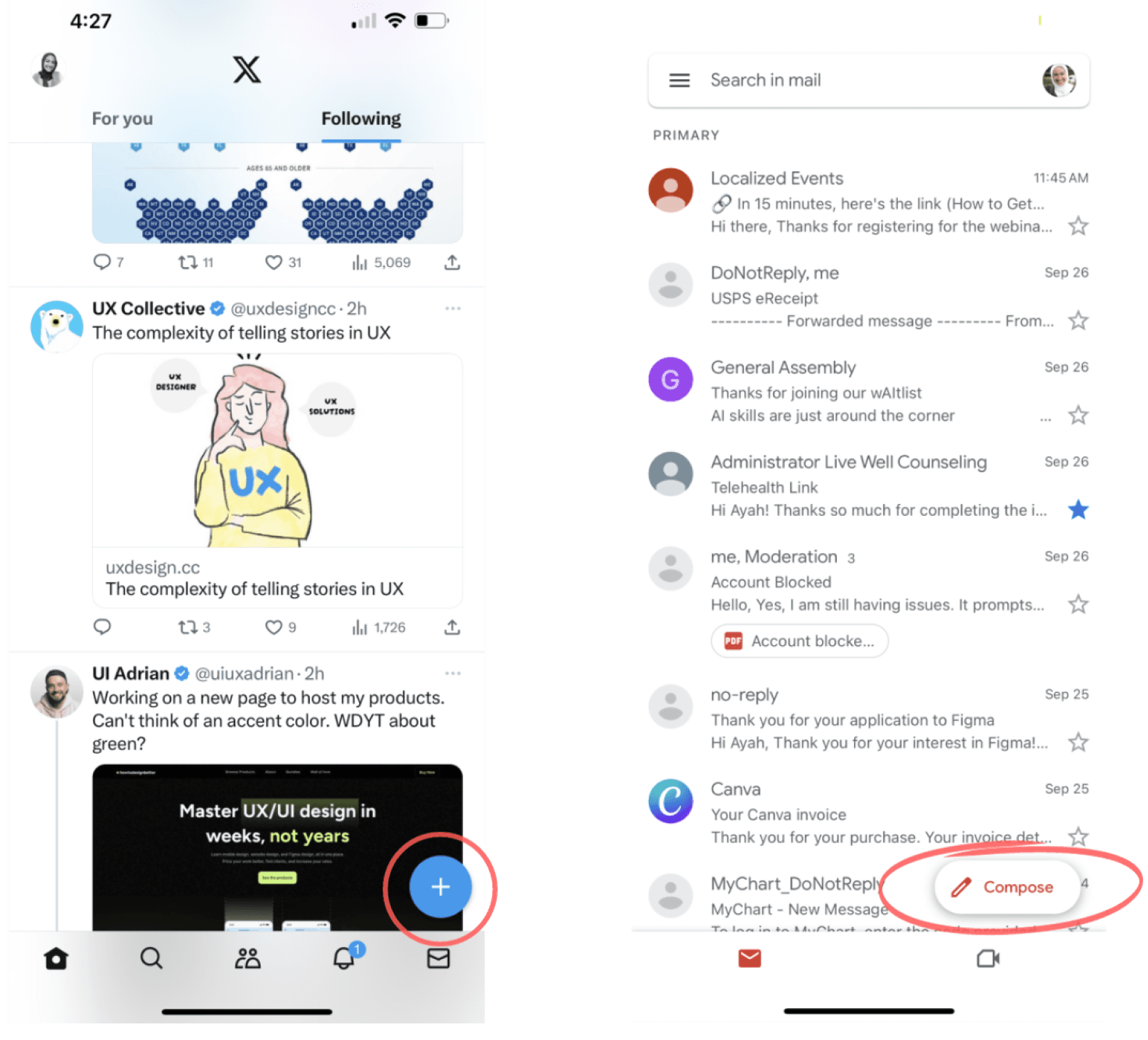
We drew inspiration from industry giants like Twitter and Gmail, both renowned for their user-friendly interfaces.
In particular, we took note of their effective utilization of fixed-position buttons for prominent calls to action. By emulating this approach, we aimed to bring the same level of accessibility and convenience to our user interface, ensuring that essential actions, such as accessing the customer queue, were consistently within reach.
Gmail
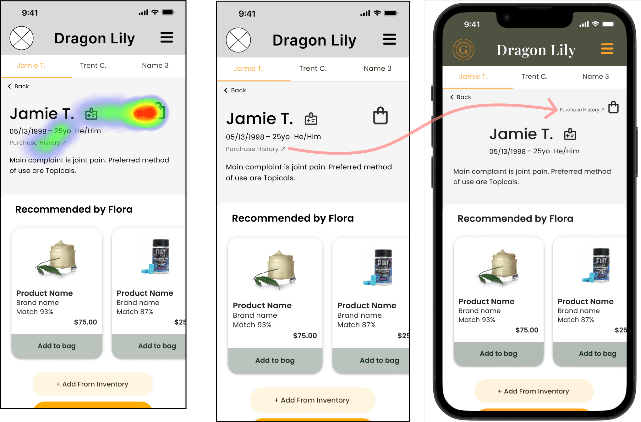
When asked to find Jamie's previous purchases, participants scanned past the target link.
Participants instinctively clicked within the vicinity of the shopping bag icon, as indicated by the click heatmap below.
Heat Map
Mid-Fidelity
High Fidelity
Heat map illustrating participants' typical click or hover behavior when prompted to find customer’s last purchase.
💡
UX Reasoning – Moving the Hyperlink
To adhere to established principles of visual design, particularly the law of proximity, we strategically relocated the 'purchase history' link adjacent to the shopping bag.
This adjustment makes it more intuitive for users to locate, as it is now positioned close to a related item, aligning with their expectations and improving overall usability.
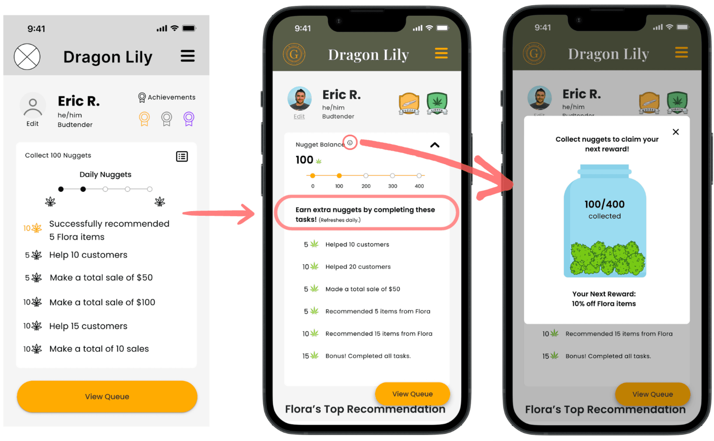
60% Had Trouble Understanding "Daily Nuggets"
As a result, we redesigned our daily nuggets menu to include a description about what it is. We also added information icon ⓘ that opens a pop up overlay for more details.
Mid-Fidelity
High Fidelity
After taking the usability test participants were asked to complete a System Usability Scale (SUS) survey. A SUS survey includes questions that ask users to rate ease of use, clarity of instructions, and overall satisfaction.
SUS Score:
91 Excellent
The Final Solution
The ability for budtenders to multitask efficiently by managing multiple customers simultaneously, enhancing productivity and customer service.
Interaction Design: Ayah Said
Identify Customer Needs
Customer Profile Enhancement: A customer profile page layout, thoughtfully crafted to present key information including the customer's main complaint.
Flora Takeaways: Utilizing insights from customer intake forms to provide budtenders with the main takeaways, enabling them to swiftly offer tailored recommendations.
Cultivating Motivation
Introducing gamification aspects such as leaderboard and lifetime badges, fostering healthy competition and motivation among employees.
Equipping budtenders with personal analytics, including Click-Through Rate (CTR) and the number of customers assisted, fostering a data-driven approach to performance enhancement.
Amplifying Expertise
Integration of comprehensive product-specific information within product cards, arming budtenders with the knowledge needed to provide informed recommendations.
My Learnings
During our research phase, we encountered a significant challenge. We needed to conduct user interviews, and our client had promised access to budtenders from partner dispensaries for these interviews. However, obtaining their contact information proved difficult, creating a bottleneck in our process.
As we waited for updates from the client, progress stagnated. To avoid being at a standstill, I suggested designing a consumer survey to gather insights independently. This decision turned out to be a pivotal moment, providing us with invaluable insights that became a vital component of our project's success.
I learned that even the best-laid plans can encounter unexpected roadblocks. To succeed, you must be adaptable and proactive, always ready to find creative solutions when things don't go as expected.
Collaborating with an experienced designer who served as my mentor provided a unique opportunity to witness the intricate art of stakeholder communication.
The wealth of knowledge I absorbed in this context significantly enriched my understanding of effective client interactions and problem-solving.
Prototype
Figma
Click the link below to access the Figma file containing the design. You can immerse yourself in the experience as Eric, assisting a customer in purchasing a recommended product!


