My Role
As one the UX designers on the team, I served as the project manager, outlining the tasks each team member needed to complete and setting deadlines for each milestone. In addition, I was the Interaction Design Lead and managed the design system.
Design Process
Discover
The first step of the design process, involved understanding the company and researching the education of puberty in health classes today. A literature review of the prior research completed from the creation of the mobile website was studied. Primary research such as surveys was conducted. Secondary desk research on puberty education in classes today and on competitors was done in this phase.
Define
After analyzing these insights, we began to conceptualize and define the problem, focusing on user flows, personas, journey maps, and How Might We (HMW) statements.
Develop
Moving into production mode, we began sketching and designing low-fidelity iterations of the interface, taking into account research-based feature prioritizations and key design principles such as brand attributes, contrast, user interactions, hierarchy, and feedback.
Deliver
Once the interface was ready, we began testing, analyzing and iterating our designs. We received feedback from other fellow senior designers in order to understand the experience gaps.
Research
Competitive & Comparative Analysis
Initially, we wanted to understand what already exists for puberty education in the market, and how they approach teaching the user to maintain user retention and engagement. By analyzing competitors' strengths and weaknesses, we were able to identify gaps in the market that Puberry can fill.
Results and Insights:
1. Other Platforms Don’t Focus on Puberty
While competitors may provide some health education, their focus primarily centers on period tracking and/or sex education. In contrast, Puberry takes a more comprehensive approach to health education by also delving deeper into the anatomy and physiology of the body during puberty and beyond.
2. There is no other gamified puberty websites
While most platforms in the health education space present educational content in the form of articles, Puberry sets itself apart by using a gamified approach to deliver its lessons by incorporating interactive games, quizzes, and challenges into its content.
This approach not only makes learning more enjoyable but also helps to reinforce key concepts and ensure better retention of information.
The gamification of health education can help break down barriers and make it more accessible to individuals who may not have been interested in or engaged with traditional educational formats.
3. There is a lack of gender inclusive language with current puberty websites
Unfortunately, many existing puberty websites fail to use gender-inclusive language, which can make individuals who identify as non-binary, gender-nonconforming, or transgender feel excluded and overlooked. This lack of inclusivity is a significant issue, as puberty can be a challenging and confusing time for all young people, regardless of their gender identity.
User Surveys
To gain a deeper understanding of how health class is currently taught in schools, we conducted 6 user surveys targeting teachers. We learned about how their schools approach to puberty education, as well as their experiences facilitating these discussions and curriculum.
Results and Insights:
Teachers stated that health education should be continuous and expand outside of health class. This is an opportunity for Puberry to expand its reach and impact by collaborating with other departments and teachers within the school.
4/6 schools don't distribute puberty products
Another significant finding was that most schools did not distribute sanitary products. The lack of access to puberty products could lead to students feeling unprepared, unsupported, and vulnerable during this important phase of their lives. This gave us insight to how valuable Puberry’s Kits would be to the student.
6/6 teachers claimed that gamified health website would be a valuable resource
All teachers claimed that a gamified health and puberty website would be a valuable resource. This is a significant finding as it suggests that there is a demand for interactive and engaging learning tools in the field of health education. Puberry's gamified educational content and digital period tracker could potentially fill this gap in the market and provide a valuable resource for both students and teachers.
Information Architecture
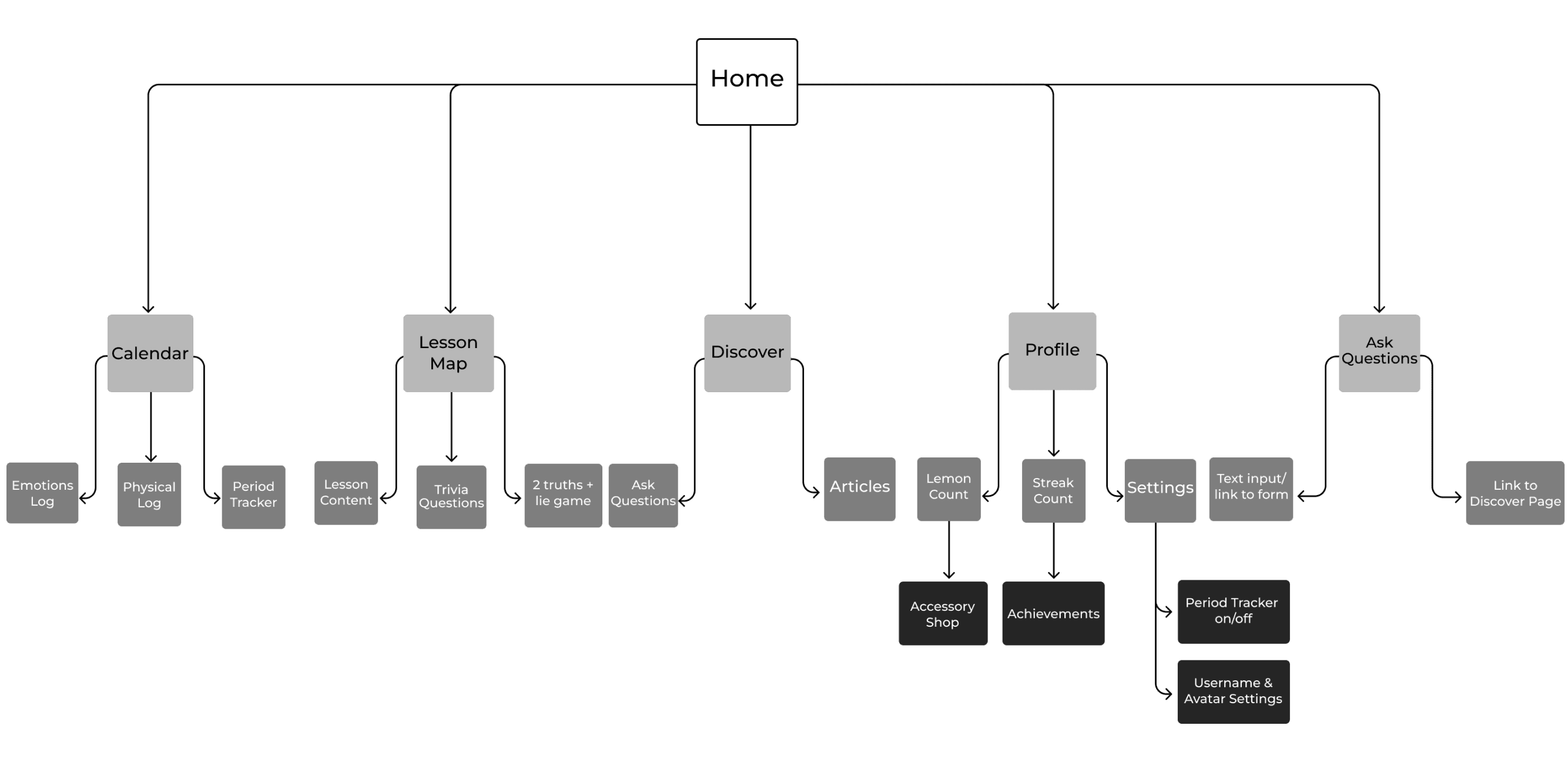
We created a site map of Puberry’s mobile interface to visualize the hierarchy of pages, ensuring that important features weren't overlooked in the desktop design. By prioritizing homepage content, we streamlined the website's structure and enhanced user experience.
Meet the Users
Primary Persona

13 years old, 7th grade
Suburbs of New York
Chloe (she/her)
Chloe has been experiencing changes with her body as she hits puberty. Her parents took the “Wait until 8th” pledge where they agreed to delay giving their children a phone until at least 8th grade. That being said, she has an iPad for educational purposes. Since Chloe doesn’t have a phone, she needs a way to access puberry on her iPad or at the school computers.
Frustrations
Peers laugh at each other’s changing bodies
Doesn't know how to use sanitary products
Feels too shy to talk to her parents about changes to her body
Other girls in school have gotten their period but she doesn't know what know what it is
Chloe’s Problem
Chloe needs a way to use Puberry on her iPad and/or computers so that she can have access to the resources and information that would help her learn about puberty.
Secondary Persona

Health and Science teacher
Ms. Luna (she/her)
Ms. Luna is a health teacher in a private 6-12 school in a suburban neighborhood in New York. She teaches a semester-long health class for 7th graders, and mainly uses videos, websites and health books to supplement her health lessons.
Needs & Goals
Needs parental approval for health curriculum and topics taught
Wants students to get the health education they need in more comfortable and less stigmatized spaces
Wants students to be comfortable asking questions about health and puberty without embarrassment.
Frustrations
Students not having more health education outside of the 1 semester of health class
Limiting health class to only 7th
Students receive little to no health products from the school
Ms. Luna’s Problem
Ms. Luna needs approval from her school and her students’ parents to use Puberry so that her students have an enjoyable and comfortable way to continue learning about puberty.
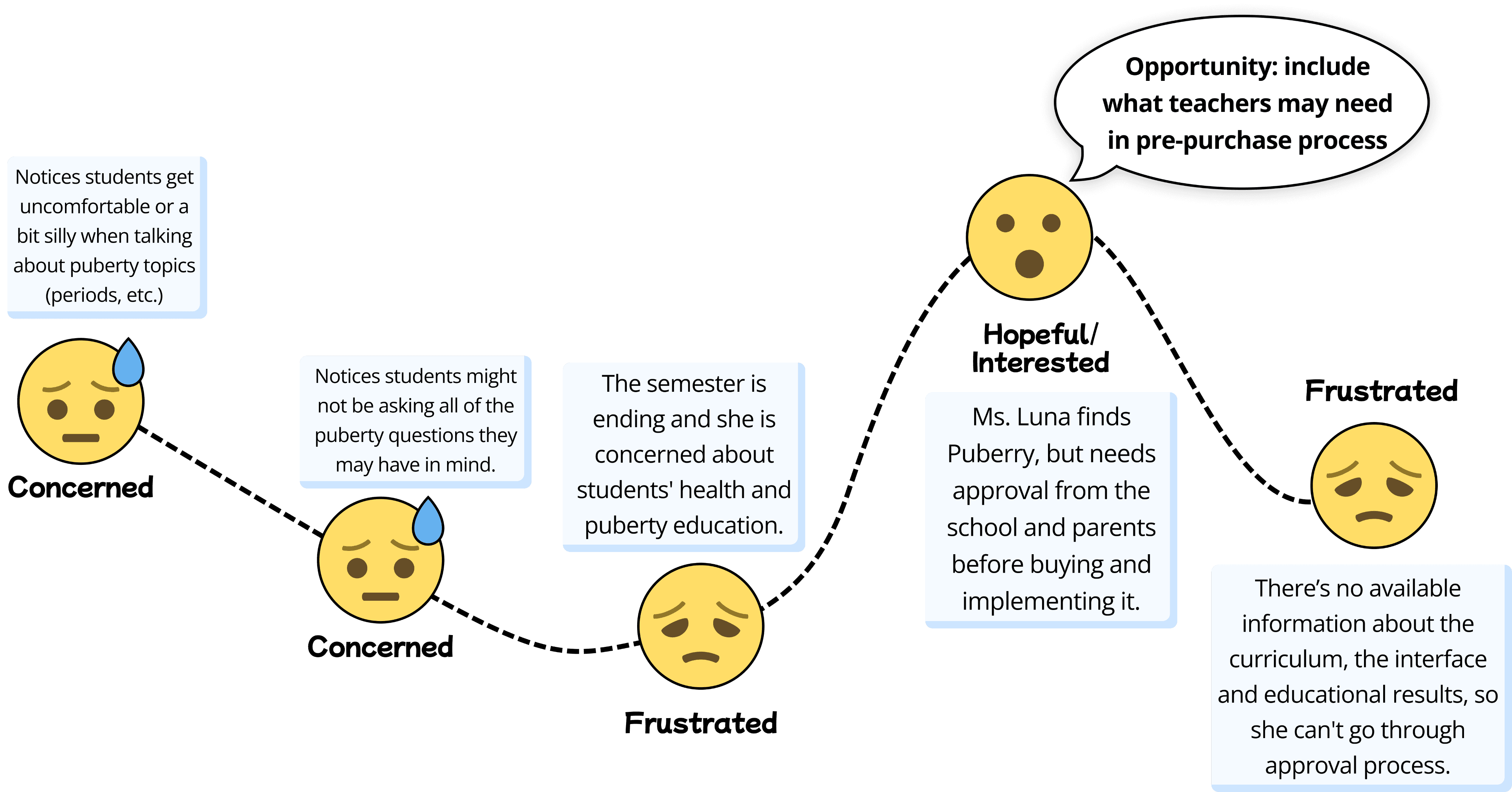
Ms. Luna’s Journey Before Puberry
While conducting thorough research on Ms. Luna and her experience teaching health class, we were able to gain a deeper understanding of her journey. We identified key touch points and emotions that were essential in her experience teaching health. Our survey also revealed that implementing Puberry in their curriculum might be a challenging task for teachers, even if they were willing to do so.
By incorporating these findings into a retrospective journey map, we can create solutions that address the pain points and challenges that teachers like Ms. Luna face. This will ultimately lead to a better user experience for both teachers and students, and a more successful implementation of Puberry in schools.
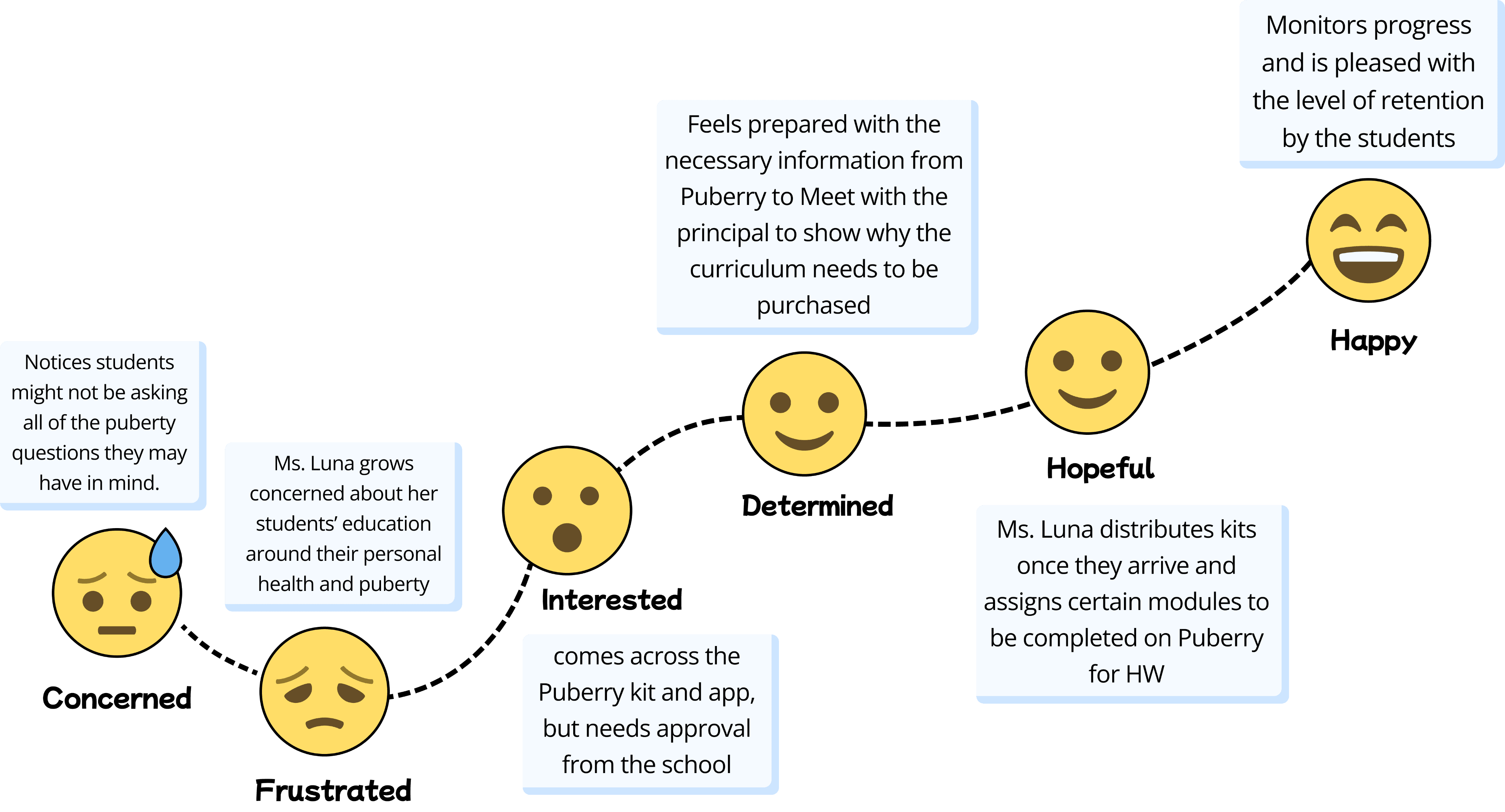
Ms. Luna’s Journey With Puberry
Creating a prospective journey map helped us in the early stages of the design process, as it allowed us to visualize and plan for the user's experience before the product or service was built. By identifying potential issues and opportunities for improvement early on, we were able to make more informed design decisions that lead to a better user experience. Below, is the visual representation of Ms.Luna’s anticipated experience with Puberry.
Design Iterations & Validations
User Flow
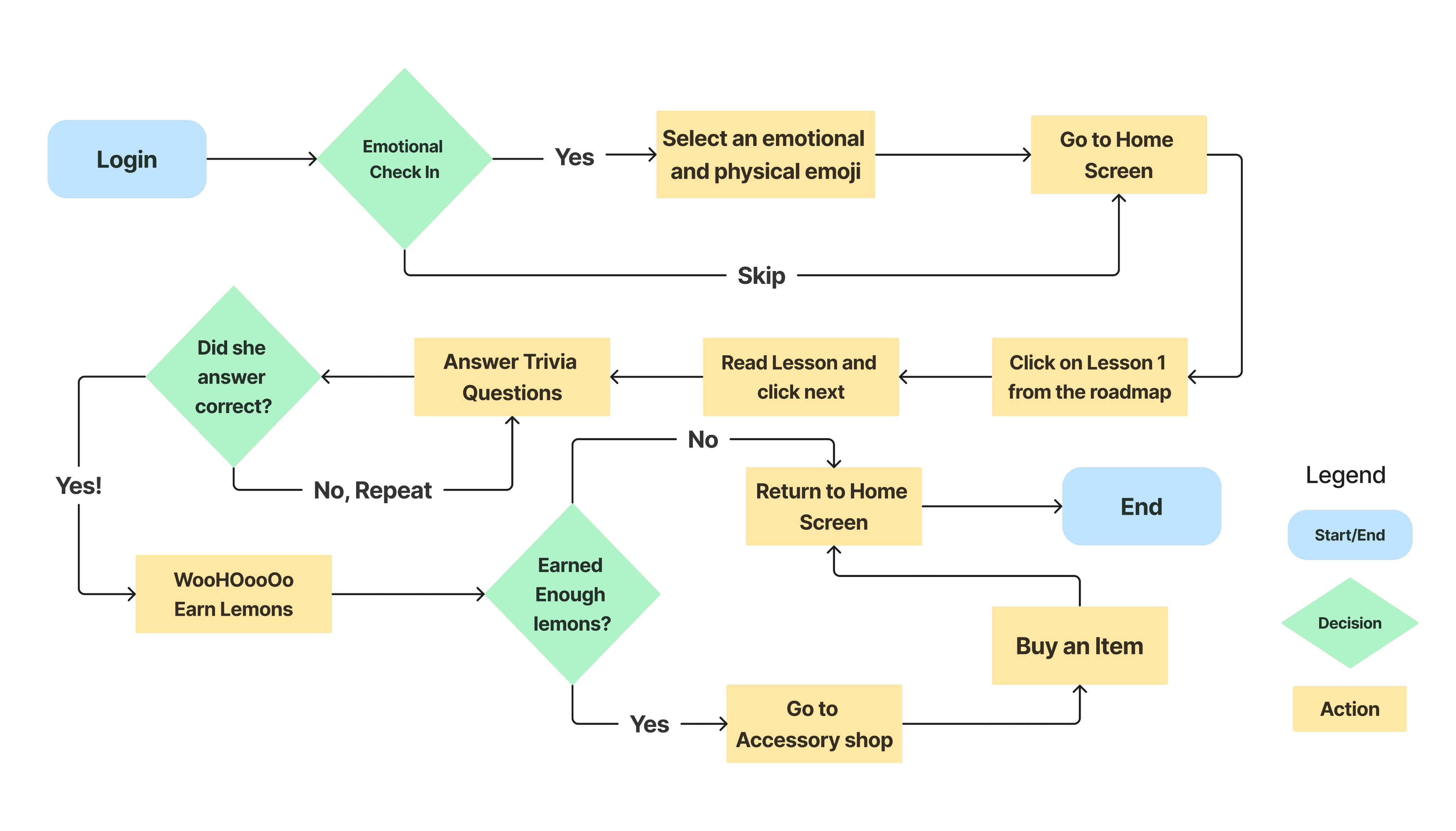
At the onset of our design phase, we made sure to have a clear understanding of the user flow in order to deliberately sketch our design concepts.
Flow: Chloe Learning a Lesson
Design Sketch Studio
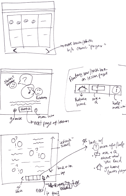
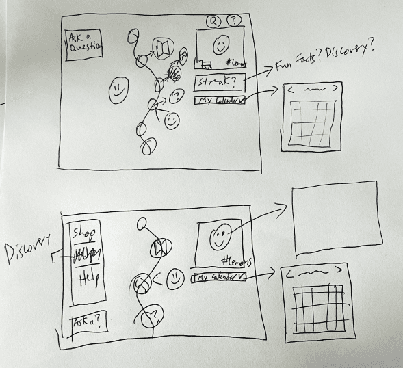
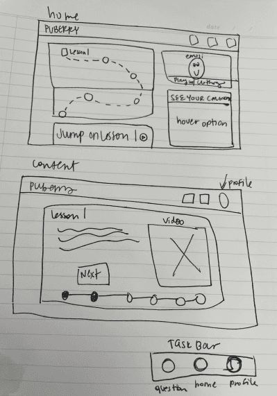
Our next step to designing is to sketch out our ideas. My ideal way to do this as a team is to hold a design studio. During our design studio session, team members shared their perspectives and insights, challenged assumptions, and we ultimately worked together to create solutions that met the needs of the user and the business. It also allowed us to quickly generate and iterate on ideas, which sped up the design process and helped us to deliver solutions faster.
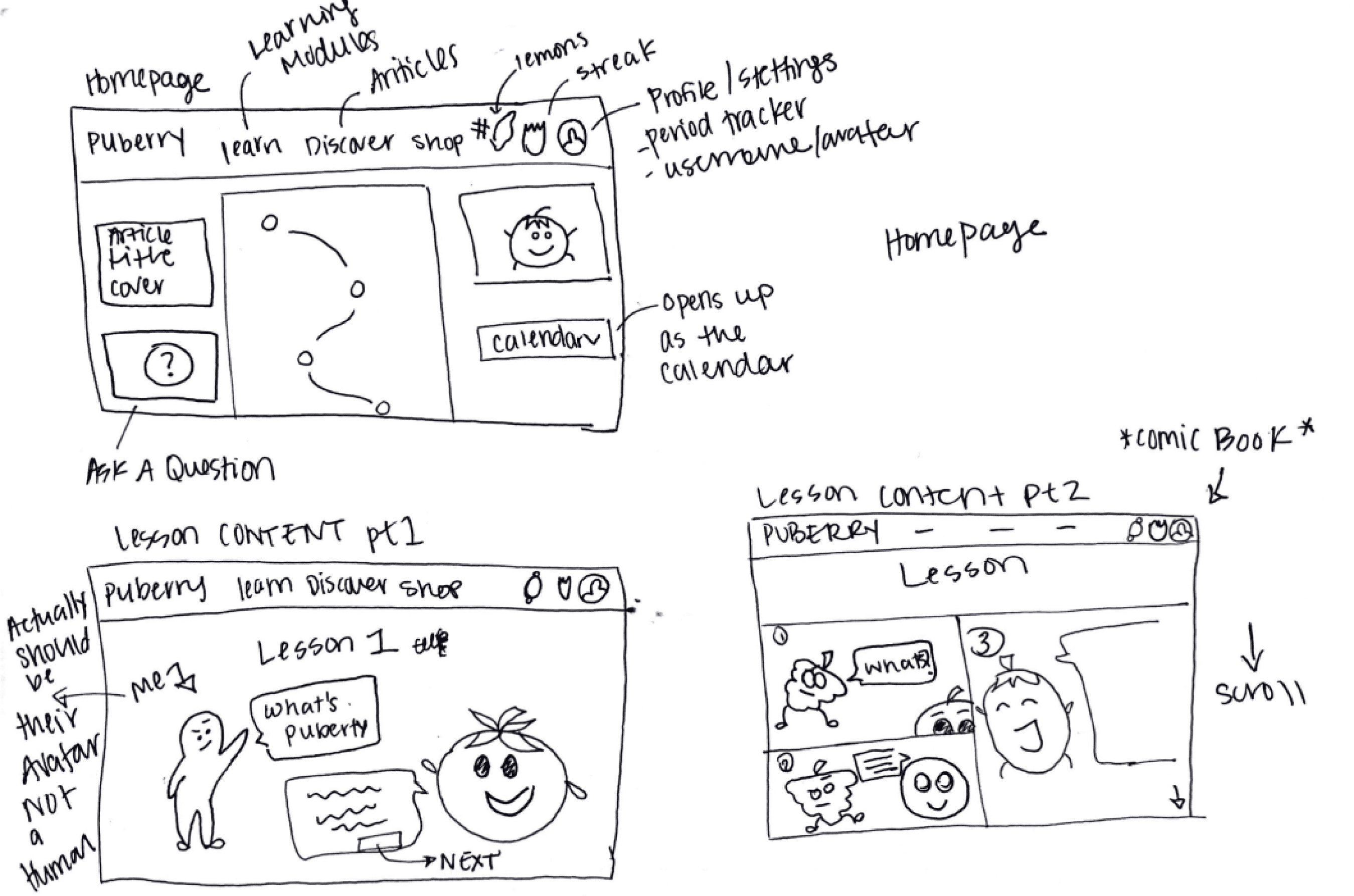
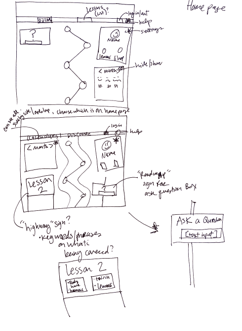
For this studio we wanted to specifically focus on how the homepage would look like as well as how the lesson content will be presented. Through this approach, we were able to roughly create more than 20 different iterations. Below are some of the notable sketches.
Drawn by: Ayah Said
The sketch above suggested that we use an accordion option that opens the emotional calendar when clicked to allow for privacy.
Drawn by: Devan Guerra
Drawn by: Franchesca Cortés
This iteration suggested that we put the streak number of days engaged with platform and number of lemons earned within the avatar card instead of in the navigation bar.
Drawn by: Bailey Alexander
This sketch offered the idea of seeing the emotional calendar only while hovering over the card for privacy.
The Solution
Usability Testing
To test our mid-fidelity wireframes we conducted 11 usability tests along with follow up short interview afterwards. We recruited our participants into two groups:
5 children (ages 8-17)
6 teachers
System Usability Scale (SUS) Score:
After taking the usability test participants were asked to complete a System Usability Scale (SUS) survey. A SUS survey includes questions that ask users to rate ease of use, clarity of instructions, and overall satisfaction.
System usability score: 86.6 (Excellent)
Privacy
Puberry offers a feature that allows the user to reflect and log emotions on to their calendar. From our research we realize that users value their privacy especially when it comes to personal more intimate topics.
We decided to include the calendar in an accordion grouped with their achievements and quick access to lessons, instead of having the calendar on full display on the Homepage,
Accessibility
2/6
young participants struggled understanding some of the vocabulary used in lessons
To ensure comprehension, we implemented a feature where users can simply hover over these words and receive both a definition and audio pronunciation.
5/11
users selected the audio option in the lesson
We also recognized that not everyone's reading capabilities are the same. In order to increase accessibility of our design we included a "text to speech" option to each chat bubble of the lesson content.
By providing both visual and auditory cues, we’re catering to different learning styles and making the lesson more accessible to a wider range of learners. Overall, this can improve the effectiveness of the lessons and increase engagement among Puberry’s audience.
Trivia Questions
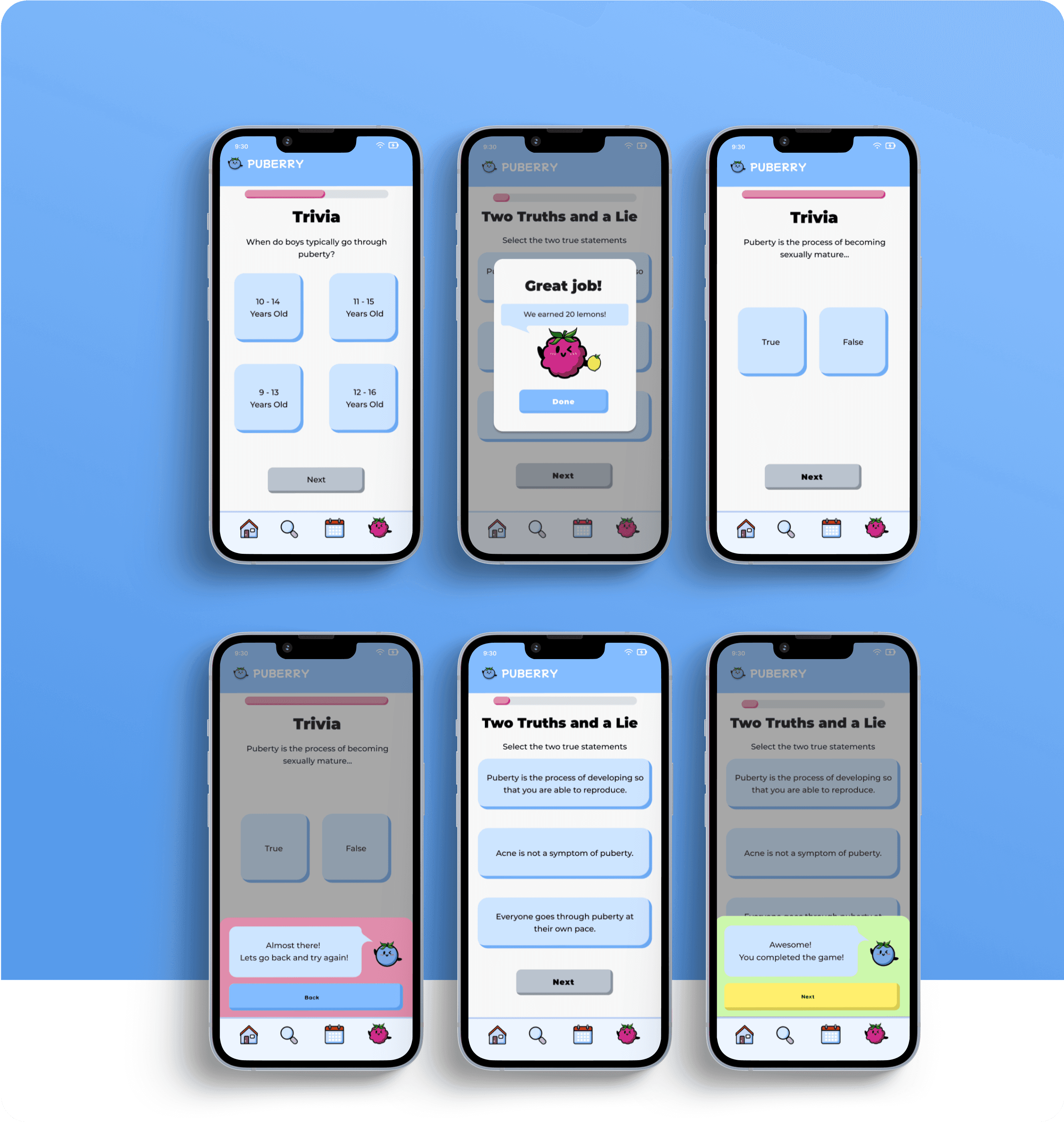
We noted that as our young participants finished the lesson readings they seemed fatigued to take the quiz questions, while 2/5 teachers also noted that they think students would lose stamina by the end of the lesson content.
To increase information retention, we dispersed smaller checkpoint questions throughout the lesson instead of grouping them all at the end. Below, are the responsive designs.
Accessory Shop
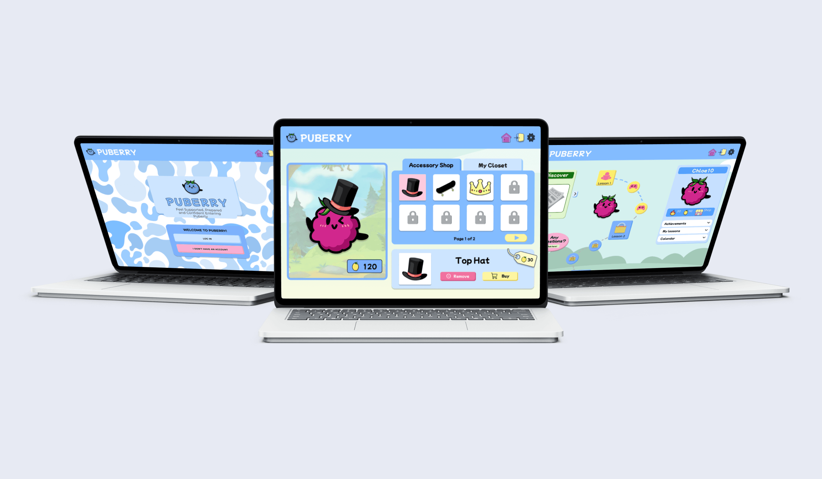
The interface incorporates playful and lively transitions to add dynamism and align with the brand's personality.
Changes made to increase shop discoverability:
The shop remained in the avatar card
An automated carousel was which includes the shop, discover, and ask-a-question features.
Users can click on their avatar to customize it, which in turn, will direct them to the shop.
Next Steps
Product Roadmap
As Puberry moves forward, we have carefully curated a set of next step suggestions aimed at optimizing the company's potential for growth and scalability.
1. Teacher Portal
In order to bring the journey of the user and the journey of the educator full-circle, adding a teacher-facing portal will empower them to shape the learning experience for their students.
Similar to the teacher portal of Canvas and Blackboard, the Interface will enable instructors to assign lesson modules tailored to the needs of individual students while also monitoring their progress and identifying any areas where they may be struggling.
This feature would be a key selling point in Puberry's pitch to schools. From our interviews with teachers we learned that the idea of Puberry being able to aid in the curriculum and structure of class is enticing.
2. Scalable Design System
4/4
Stated they would continue using Puberry even outside of class

Although the design of the current interface is very cute, it seems to be specifically enticing to the younger audience. To effectively target Puberry’s intended age range, including users from ages 6 to 18, and extend the platform’s reach beyond the classroom, we recommend the development of a design system that can scale up to older age groups.
Validation
The Puberry site launched its pilot end of February 2023, a few weeks after we handed off our designs. That said, launching this functionality is only the first step towards the program’s success.
Analyzing metrics such as lesson completions, daily logging frequency, total lemons earned over time, and interests collected on the onboard would be important for understanding success and elaborating the product roadmap.
My Learnings
1. The importance of research
Compared to previous projects, this project was a lot more research heavy. I saw this as an opportunity to strengthen my research skills and get more involved in the process of learning about our users and their needs. Some of the methods and situations which I encountered for the first time were eye-opening and will be helpful to use moving forward in my design career.
2. Design Systematically
Learning how to design systematically was also part of my growing path in this project. First, because introducing new features doesn’t mean simply adding a line or an icon to the UI, that’s why the tough question of “What’s more important than what” helped us to prioritize what was relevant for users in a specific context and define logics behind even before the UI was thought out. Second, reusing or improving components from the Puberry Design System – already tested and accessible – played a great role.
