Project Overview
About Resy
Since it’s inception in 2014, Resy has become a destination for restaurant discovery and booking all in one place. Diners around the world rely on Resy for intel and access to the most exciting restaurants.
The Problem
The restaurant industry took a big hit due to the pandemic closing down dining and as a result, fine dining experiences have really struggled to go back to the way they used to be and bounce back in hitting their booking numbers. Resy was interested in adapting to the new reality to maintain positive and new experiences for their users while also increasing booking numbers
The Solution
Create a flow for users to become loyal members of the platform through a subscription service to increase user engagement.
Designed an interactive prototype that is accessible and WCAG 2.0 Level AAA compliant.
Approach
UX Methodologies utilized:
User Research – interviews, surveys, usability testing
Affinity Mapping
Task Analysis
Personas
User journeys
Information architecture
Wireframing and prototyping
User testing and feedback
Iterative design
Accessibility design
Design systems
Design Toolkit
Figma
Trello
Notion
G Suite
Results
The Resy app redesign and feature implementation increased the overall usability and satisfaction with the app.
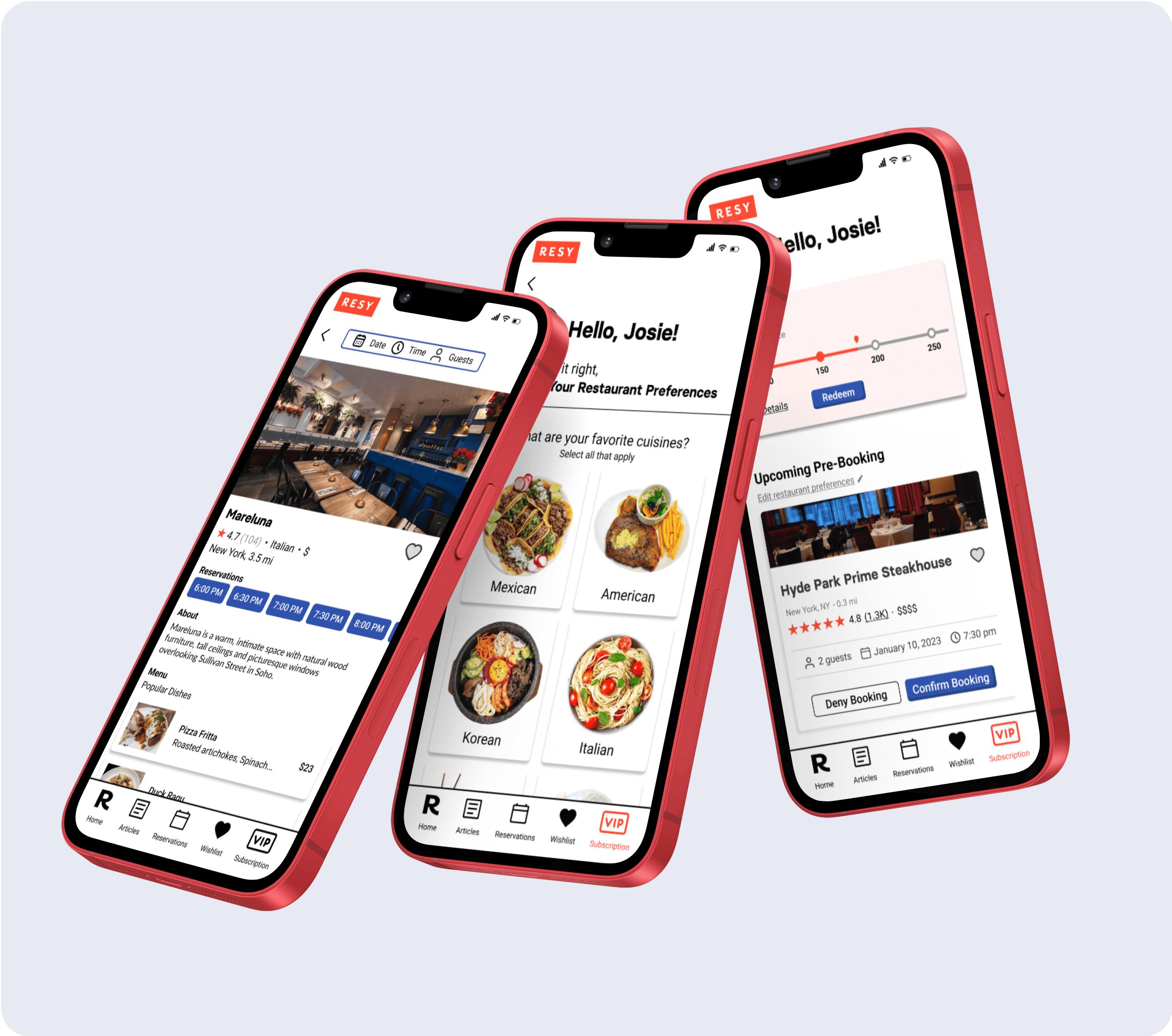
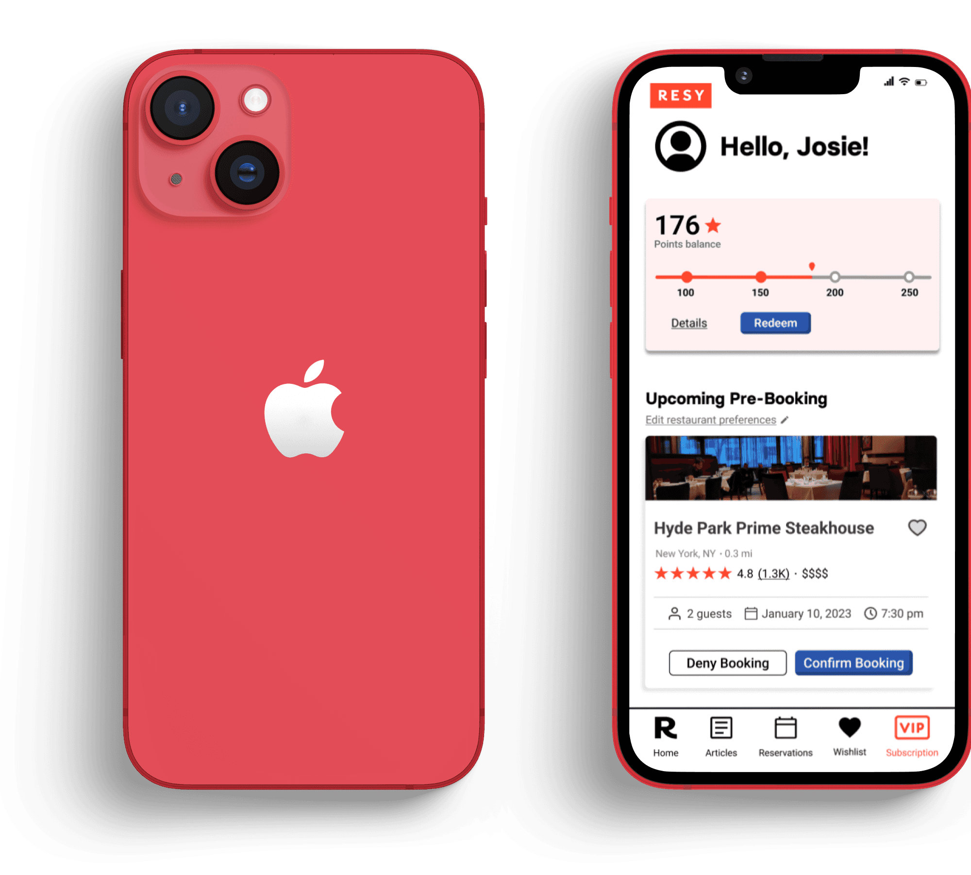
Our Resy subscription service offers subscribers pre-booking suggestions based on their dining preferences and a rewards system that encourages diners to engage with Resy to receive discounts and special offers on a points-based system.
High-level Goals
1.
Subscription Service
Entice users in a VIP-like fashion through a subscription service that would pre-book reservations to increase booking numbers.
2.
Branding
Elevate the user experience across all devices by redesigning the mobile app to harmonize with the desktop interface.
My Role
As one the UX designers on the team, I served as the project manager, outlining the tasks each team member needed to complete and setting deadlines for each milestone. In addition, I led the user research for the project.
Design Process
Discover
The first step of the design process, involved understanding the company. Primary research such as user interviews was conducted. Secondary desk research on Resy and on other online booking platforms was completed in this phase.
Define
After analyzing these insights, we began to conceptualize and define the problem, focusing on user flows, personas, journey maps, and How Might We (HMW) statements.
Develop
Moving into production mode, we began sketching and designing low-fidelity iterations of the interface, taking into account research-based feature prioritizations and key design principles such as brand attributes, contrast, user interactions, hierarchy, and feedback.
Deliver
Once the interface was ready, we began testing, analyzing and iterating our designs. We received feedback from other fellow senior designers in order to understand the experience gaps.
Research Methods
Site Analytics
A notable finding we learned through running a site analysis on Resy was learning that most of the traffic was coming from mobile devices. This lead us to direct our efforts into creating an efficient and usable mobile-first experience.
User Interviews
8 participants | 4 Male : 4 Female | Ages 23 - 60
The participants come from many different states across the east coast. The interview took approximately 30 minutes and included topics to get to the core of what users are trying to do and what their problems are. So we asked:
How many times last month did you go out to eat? Why do/don’t you like to go out to eat?
What do you consider when deciding which restaurant to go to?
How often do you try new restaurants? Why?
When was the last time you booked a reservation? Take me through the process.
What kind of features or perks would you like if a restaurant reservation website offered a subscription service?
Customer Insights
What does this mean to us?
Competitive & Comparative Analysis
Direct Competitors
We identified 3 direct competitors who are involved with online restaurant booking and reservations and solving the same problem:
Yelp
OpenTable
Tock
Market Insights
No other platform offers a subscription service
We realized that this could help Resy stand out against these other platforms. That being said, this made us question why these established competitors are not exploring a subscription service.
Our Hypothesis:
Resy's target audience is the key factor in play. As Resy dominates the fine-dining space, users seek out upper-scale dining experiences. A subscription service offering VIP-like pre-bookings may appeal to common Resy users, but not OpenTable or Yelp's wider audience.
Confirming our Hypothesis:
Our user research led us to this perspective, we would like to validate in 2 ways:
Inspect the site analytics after the feature goes live. Examining metrics such as subscription rates, the percentage of subscribers following through with their pre-bookings versus canceling, and the duration they remain a subscriber, will be key to understanding the long-term success of the feature.
Interviewing users that enjoy fine dining and prefer upscale restaurants.
2. Restaurant Preferences
Enabling users to save information such as food allergies, special requests, and cuisine preferences fosters a customized experience, a feature only Tock has. We kept this in mind when brainstorming ways to make personalized pre-bookings through the subscription service.
3. Website Accessibility
Lastly, while both OpenTable and Yelp offer accessibility adjustments on their websites, Resy currently does not. By making a website accessible, we are ensuring that all potential users, regardless of their abilities, can enjoy a seamless user experience.
Indirect Competitors
In addition, we identified indirect competitors to research data and habits related to other current Loyalty Programs. The goal was to understand how they behave and benchmark innovative reward programs.
The article, “10 Examples of Innovative Customer Loyalty Programs” published by Lindsey Peacock highlights relevant examples such as Sephora, Amazon Prime, Starbucks and Apple. Addressing different techniques for redeeming points and rewards.
Market Insights
The main insights found is that Loyalty programs have been proven as one of the most effective tactics for increasing revenue and inspiring customer loyalty. As many as 84% of consumers say they’re more apt to stick with a brand that offers a loyalty program.
“As consumers, we can be pretty cynical about brands and marketing initiatives. We know the end goal is always to convince us to buy more products and spend more money”. That’s why the most innovative loyalty program takes the focus away from getting customers to spend more, and re-centers itself on creating value for them.
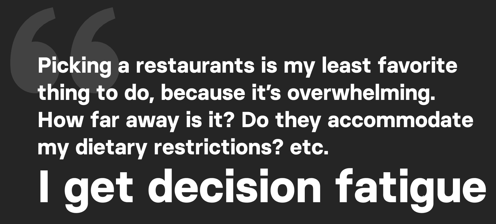
By integrating users’ pain points and market insights, we learned that it’s possible to create a reward program that isn’t based solely on earning points by booking, but which adds value to a user’s daily life. Thus, the value proposition hypothesis is based on helping users discover new restaurants by taking away the frustration of picking a restaurant — since 70% of our interviewed users claim to struggle with that.
Usability Testing on Resy
To understand the user’s journey as they currently use Resy, we conducted usability tests on 8 participants. Our goal was to observe how users interact with the Resy website and determine if any improvements could be made beyond the addition of a subscription feature to enhance the overall user experience.
Factors that we used to define usability were:
Effectiveness
How quickly could users perform tasks.
Errors & Error Frequency
How often did a user make errors while completing tasks?
Satisfaction
After completing their task does the user have a good feeling about the website?
This was assessed by administrating the System Usability Scale (SUS) survey.
Task: Find a restaurant near you to book a reservation.
WHY?
Reason 1:
Resy does not allow users to search by location. You can not select a different city that is not already listed on their limited drop down menu. Resy will initially track your device’s location and recommend spots near you, but you can not change it to a city that is not listed on the menu.
Reason 2:
Resy's restaurant suggestions are somewhat limited, as users outside of larger cities may only receive approximately 10 recommendations. This poses an issue because there are numerous great restaurants available, but they may not be easily discoverable on the Resy platform.
System Usability Scale (SUS) Score:
59.6 Poor
Meet the Users
Primary Persona
Brooklyn, NY
Marketing Manager
Over $100K per year
35 years old
Jocelyn “Josie” (she/her)
Josie is a busy professional who values efficiency and convenience. She has a demanding job that requires her to work long hours and attend multiple meetings throughout the week. Despite her busy schedule, Josie still values the finer things in life, including dining at high-end restaurants.
🎯
Goals
Josie's goal is to enjoy memorable dining experiences with minimal effort and hassle. She wants to impress her clients and colleagues with her restaurant choices to make a positive impression on them. She also wants to continue exploring new dining options and stay on top of the latest food trends.
❤️
Needs
Easy-to-use website for quick information access.
The app must protect personal data and prevent breaches.
Interface responsiveness to her various devices as she's always on the go.
👋🏼
Behaviors
Goes out to eat multiple days a week
Loves trying new cuisines
Considers reviews when discovering new restaurants
😢
Pain Points
Limited availability at high-end restaurants.
Struggles to find time to research and book reservations, making it hard to secure ideal reservation times.
Inconvenient to keep track of multiple bookings.
FOMO when she is unable to secure a reservation at a popular restaurant or misses out on a special dining event
Pressure to impress clients with dining choices, causing anxiety.
Retrospective Journey Map
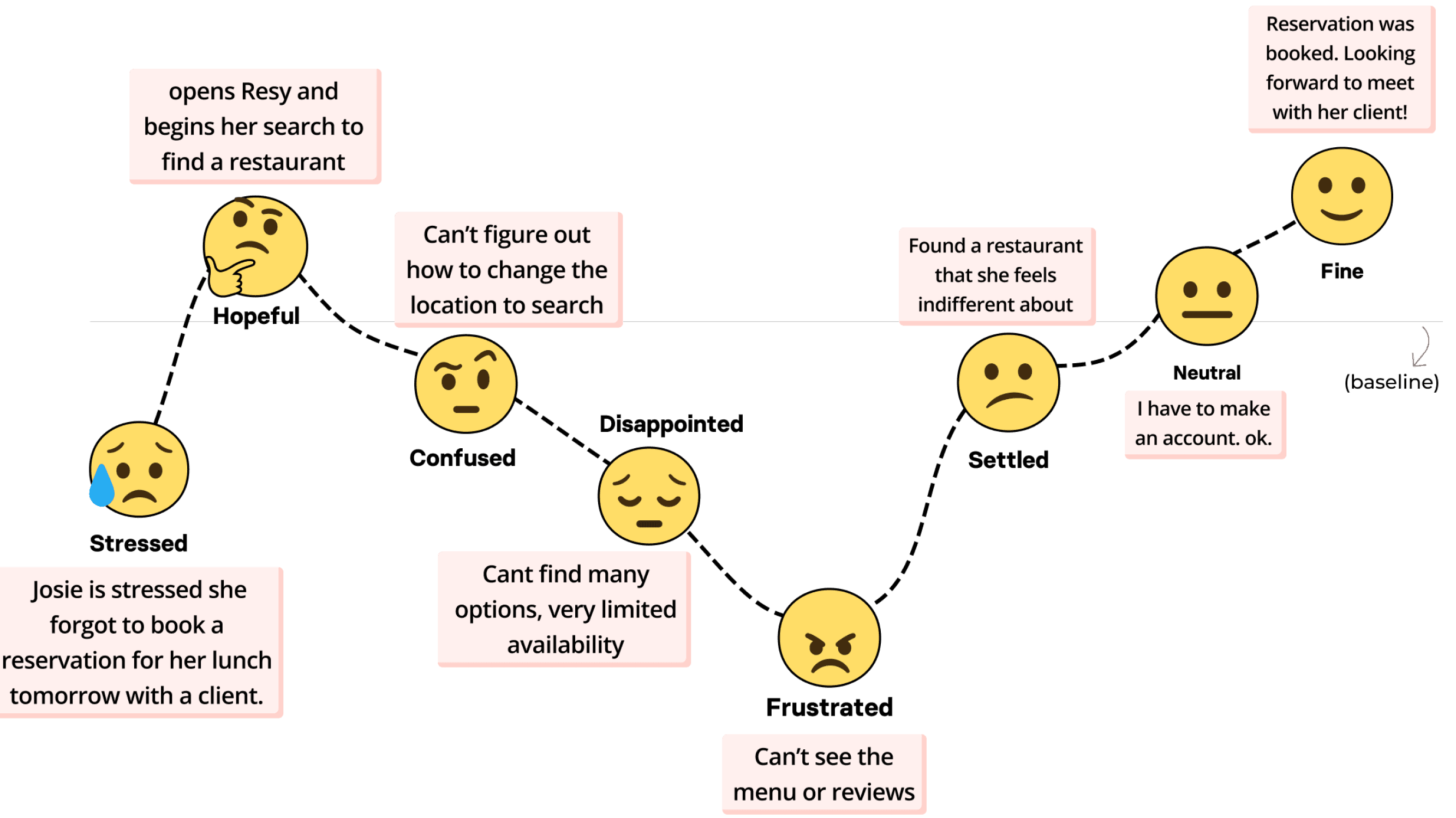
While conducting thorough research on Josie and her booking experience on Resy, we were able to gain a deeper understanding of her journey. We identified key touch points and emotions that were essential at the intersection of her job and using the platform.
By incorporating these findings into a retrospective journey map, we can create solutions in the subscription service that address the pain points that users like Josie face. This will ultimately lead a more successful implementation of this new feature.
Josie Before Resy’s Subscription
Design Iterations
User Flow
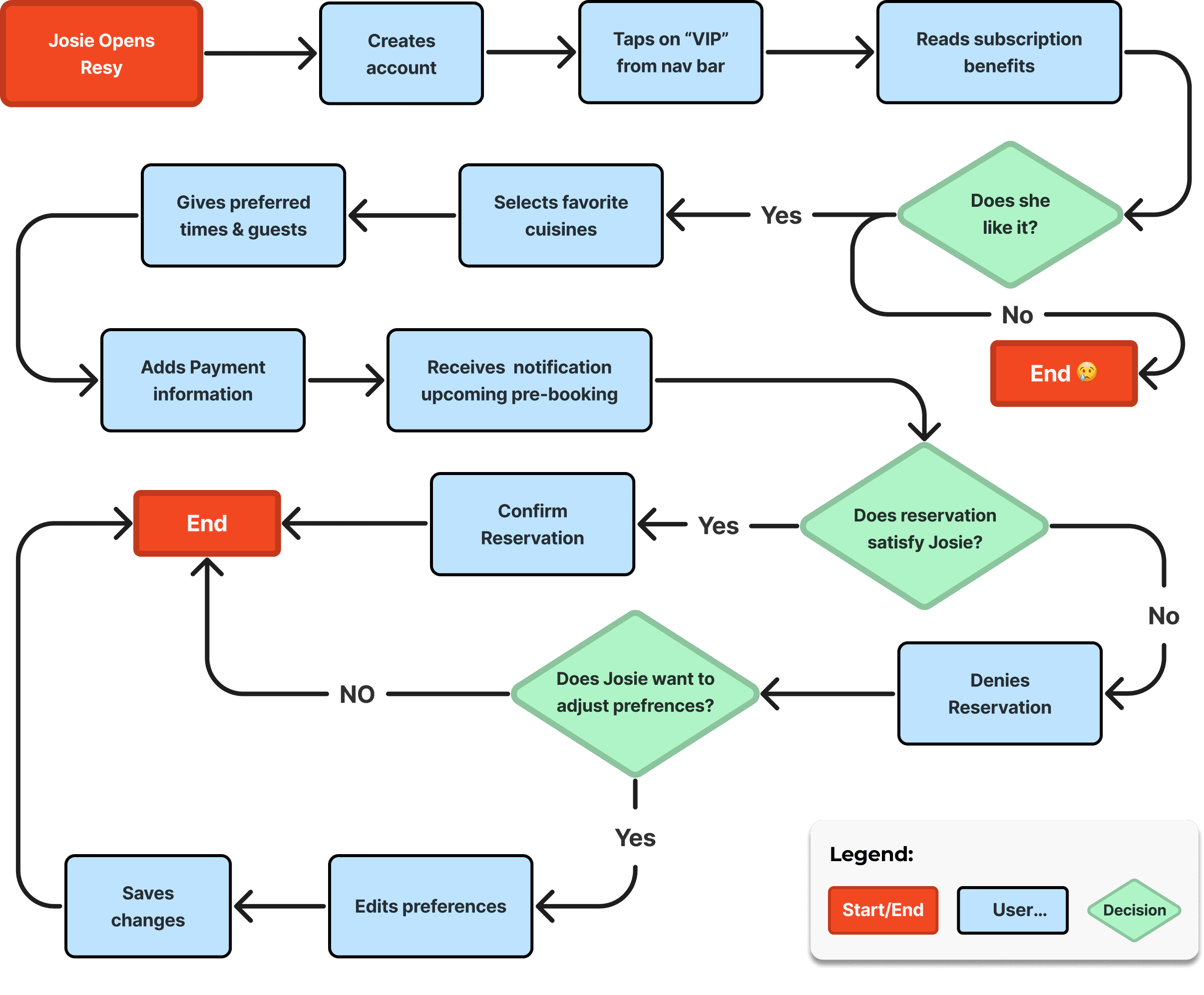
At the onset of our design phase, we made sure to have a clear understanding of the user flow in order to deliberately sketch our design concepts.
Josie Becoming a Resy Member
Storyboard
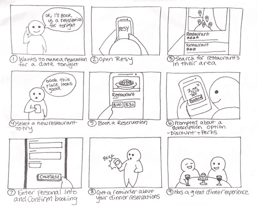
A storyboard was important in our UX process as it helped us visualize the user journey, communicate our ideas effectively, iterate and refine designs before moving on to detailed prototypes. They ultimately help create a more user-centered design.
Design Sketch Studio
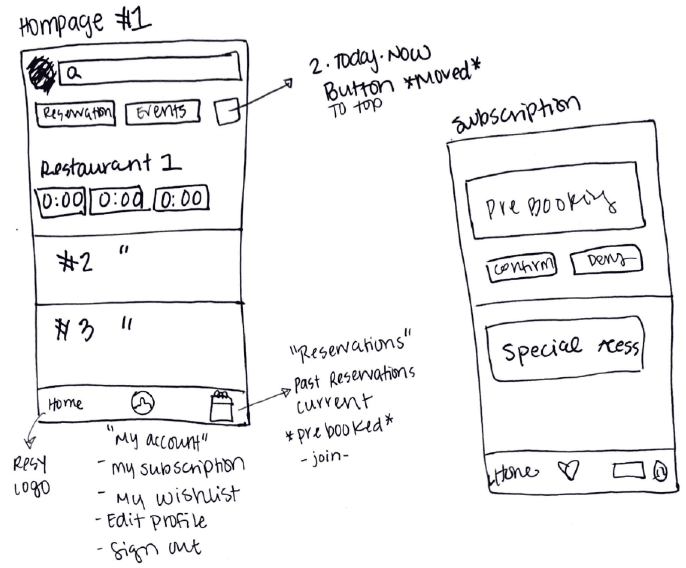
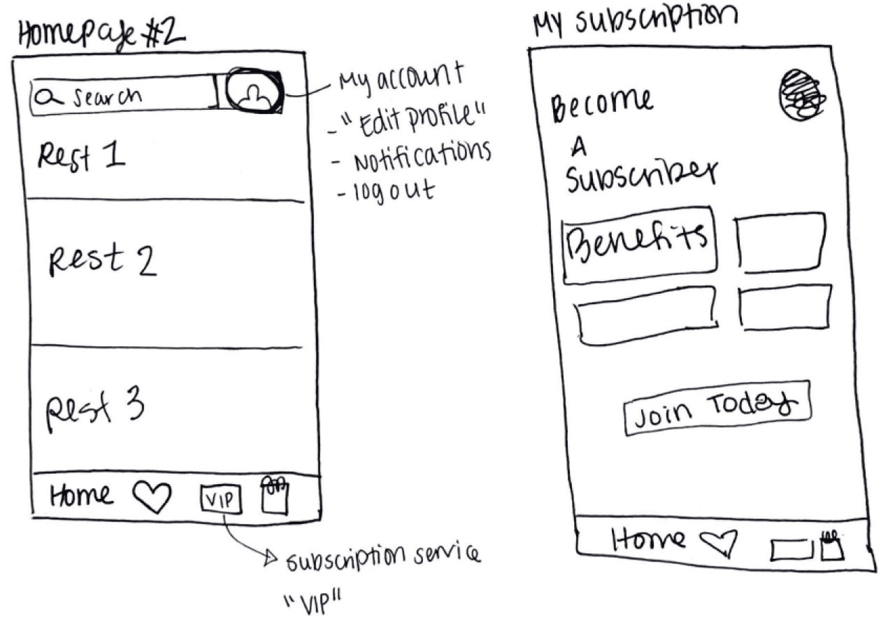
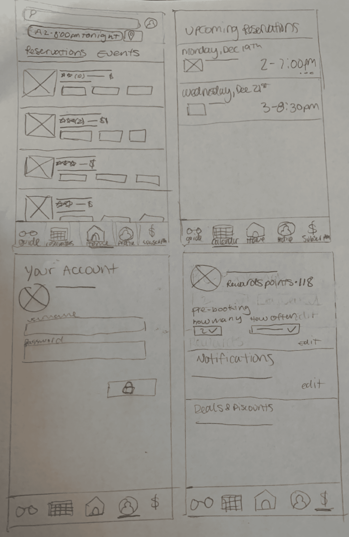
As we moved into our design phase we decided to hold a design studio. This way we can get a better understanding of how everyone on the team envisioned the subscription feature and the changes we would want to make. This also allowed us to bounce ideas off each other’s design sketches. Through this approach, we were able to roughly create more than 20 different iterations. Below are some of these sketches.
Drawn by: Ayah Said
This sketch introduced using a “VIP” badge as the icon for the subscription feature on the navigation bar. It would entice our main persona, Josie.
We debated using a "$" sign as the subscription icon on the navigation bar,We decided against it due to the potential confusion with payment and finance-related features.
The Solution & Validation
Usability Testing
To test our mid-fidelity wireframes we conducted 8 usability tests along with a short follow up interview afterwards.
System Usability Scale (SUS) Score:
After taking the usability test participants were asked to complete a System Usability Scale (SUS) survey. A SUS survey includes questions that ask users to rate ease of use, clarity of instructions, and overall satisfaction.
System Usability Scale (SUS) Score:
89.7 Excellent
7/8
Liked the subscription flow
Comments such as, easy and fun to use, visually aesthetic, and straight forward were used to describe the subscription feature.
Subscription Feature
When enrolling to become a member, the user is given the opportunity to add their preferences. This way Resy can create customized pre-bookings.
Visual and Interaction design by: Ayah Said
VIP Homepage
After successful enrollment, the user will gain access to their VIP account, where they can conveniently monitor their accumulated points. Additionally, this page provides a streamlined interface to manage upcoming pre-bookings and adjust restaurant preferences with ease.
Visual and Interaction design by: Ayah Said
Accessibility
The old Resy website's buttons were only AA compliant, meaning they met the minimum accessibility standards set by the Web Content Accessibility Guidelines (WCAG) 2.0. However, to provide a better user experience and make the website more inclusive, the buttons were upgraded to meet the AAA compliance standard.
7:30 PM
Resy also did not include restaurant accessibility information. These deatils are crucial for people with disabilities to make informed decisions about which restaurants to visit. That is information that we added in our redesign.
Accessibility and Inclusion
Wheelchair Access, Gender Neutral Restroom
Restaurant Discovery
In the past, Resy did not offer users the convenience of viewing pictures, reviews, or menus when browsing through restaurants. This lack of crucial information put a considerable burden on users, hindering their ability to discover new dining options and limiting their control over the experience. In fact, our usability testing confirmed that this shortcoming often led to user frustration.
As shown below, we decided to include this information in our redesign.
Visual and Interaction design by: Gia Toledo and Kaitlyn Peterson
Next Steps
Product Roadmap
1. Syncing User’s Calendar to Resy
To enhance the subscription experience and deliver greater value to our users, we are considering a new feature that would synchronize Resy with their personal calendar. By doing so, whenever a subscriber adds a client meeting to their calendar, Resy would automatically reserve a restaurant for the occasion. This feature would ensure that users never have to worry about double-booking or missing out on a great dining opportunity due to conflicting schedules.
2. Subscription Analytics
We would want to implement site analytics to gain insights into how frequently our users interact with the subscription feature. By leveraging this data, we can better understand our users' needs and preferences and optimize the subscription experience to provide maximum value.
My Learnings
1. Collaboration is key
While I do have experience working within interdisciplinary teams and leading creative direction through past jobs, this was my first time working with fellow UX designers, which brought on its own set of challenges. I had to learn to be more aware and open to constructive critique, as well as learn how to adapt to other designers’ habits and methods. This project has allowed me to develop new collaboration skills that will be helpful for other projects in the future.
2. Project Management
Stepping into the role of a project manager for the first time was initially outside of my comfort zone. At the start of the project, I felt uncertain and overwhelmed by my new responsibilities. However, I quickly learned to adapt to the challenge by seeking advice from more experienced colleagues, developing a clear project plan, and communicating effectively with the project team.
