


High-level Goals

2.
Adding Value
Brainstorm and generate a user flow to benefit the business and add value.
My Role
As the sole UX designer on this project, my role encompassed all aspects of the redesign process, from research and analysis to design and testing. This required me to be highly self-motivated, organized, and capable of working independently.
Design Process
Discover
The first step of the design process, involved understanding the company. Primary research such as user interviews was conducted. Secondary desk research on The Book Loft and on other online booking platforms was completed in this phase.
Define
After analyzing these insights, we began to conceptualize and define the problem, focusing on user flows, personas, journey maps, and How Might We (HMW) statements.
Develop
Moving into production mode, we began sketching and designing low-fidelity iterations of the interface, taking into account research-based feature prioritizations and key design principles such as brand attributes, contrast, user interactions, hierarchy, and feedback.
Deliver
Once the interface was ready, we began testing, analyzing and iterating our designs. We received feedback from other fellow senior designers in order to understand the experience gaps.
Research Methods
Heuristic Analysis
I used Jakob Nielsen's 10 heuristics for user interface design to evaluate The Book Loft's website against established design principles and industry standards. This allowed me to identify usability issues and inform my design decisions.
Heuristic #8: Aesthetic and Minimalist Design
Opportunities
The landing page has a lot going on which can be overwhelming.
Signal-to-noise ratio: there is a lot of noise compared to actual clickable action.
All the elements on the page are fighting for attention and the user can’t tell where to look.
Recommendations
Consider moving the “notables” section and that is on the currently on the side of the page.
Create a visual hierarchy by rearranging and prioritizing the design elements, such as text, images, and buttons, in a way that guides the user's attention and communicates the importance of each element.
The Book Loft’s landing page (3/23/23)
Heuristic #3: User Freedom and Control
Opportunities
I can't find where to browse books by genre. this Increases a user’s cognitive load to look for selection of books.
The only options I am given to browse books are “staff’s picks”, and “featured titles”.
Recommendations
Consider reconstructing the information architecture and creating a global navigation with genres to click.
Heuristic #4: Consistency and standards
Opportunities
The books displayed on the landing page give affordance but are not clickable This is a clear example of not following external consistencies of e-commerce sites.
Banners look like they are huge call to action buttons but they’re just static headings.
Recommendations
Navigating to the product details page upon clicking on the book cover.
Take away the box around the text to make it look less like a call to action button.
The Book Loft’s landing page (3/23/23)
Usability Testing on The Book Loft
After carefully analyzing the website and considering potential improvements, I proceeded to conduct 4 comprehensive usability tests to observe and evaluate how users interacted with The Book Loft website. By doing so, I was able to validate the changes I wanted to make and also identify specific areas that required improvement.
Factors that we used to define usability were:
Effectiveness
How quickly could users perform tasks.
Errors & Error Frequency
How often did a user make errors while completing tasks?
Satisfaction
After completing their task does the user have a good feeling about the website?
This was assessed by administrating the System Usability Scale (SUS) survey.
Task: Find a book in your favorite genre.

# of Errors
User 1
User 2
User 3
User 4
7
4
6
5
Reason:
The Book Loft’s website does not allow for users to browse books by genre. They can only search for a book title or browse the “Featured Titles” or “Staff’s Picks”.
System Usability Scale (SUS) Score:
50.6 Poor
Competitive Analysis
I identified 3 direct competitors who are all large, well-established online retailers of books and other media. They compete in the same market and offer similar products, so they are natural competitors. Additionally, many consumers who shop for books online may consider multiple retailers, including Amazon, Barnes & Noble, and Half Price Books, when deciding where to make a purchase.


Market Insights
1. Every other platform allows their users to browse by genres
The websites of all competitors share a well-established navigation system, enabling users to explore books while perusing customer reviews. Conversely, The Book Loft website is lacking such a system, hindering the user's ability to browse and discover books.
2. Personalized Customer Service
The Book Loft's main strengths are its curated selection of titles and its personalized customer service. Unlike Amazon, The Book Loft's physical location provides a unique browsing experience that allows customers to discover new titles and engage with staff recommendations.
Amazon dominates the online retail industry, with an expansive selection of books, competitive pricing, and fast delivery times. However, the company's focus on efficiency and scale can result in a less personalized user experience, and its sheer size can make it overwhelming to navigate for some users.
User Interviews
4 participants | 2 Male : 2 Female | Ages 23 - 33
After identifying the UX gaps within the website, I aimed to gain a more comprehensive understanding of the target users, including their motivations, goals, and frustrations. To achieve this, I conducted 4 user interviews and asked the following questions:
How often do you read in a week?
Via which medium do you consume your books and why?
Physical books, eBooks, Audiobooks, etc
Where do you like shopping for books
How do you decide which books you’ll buy?
How do you keep track of your books and what books you plan to read next?
User Insights
Browsing
Affordability
Users expressed their desire to be able to quickly and easily navigate through the website, view book covers and read book descriptions before making a decision to purchase.
Users tend to prefer borrowing books rather than purchasing them, whether it be physical books from the library or audiobooks from platforms like Libby. Borrowing provides a cost-effective way to consume literature without the expense of ownership.
Meet the User
Primary Persona

Olivia’s Problem
Olivia need to be able to browse and find books easily so that they purchase a book.
Retrospective Journey Map
While conducting thorough research on Olivia and her experience using The Book Loft, I was able to gain a deeper understanding of her journey. I identified key touch points and emotions that were essential at the intersection of her needs and using the platform.
By incorporating these findings into a retrospective journey map, I can create solutions in the website redesign that address the pain points that users like Olivia face.
Olivia’s Journey Using The Current Book Loft Website

Design Iterations
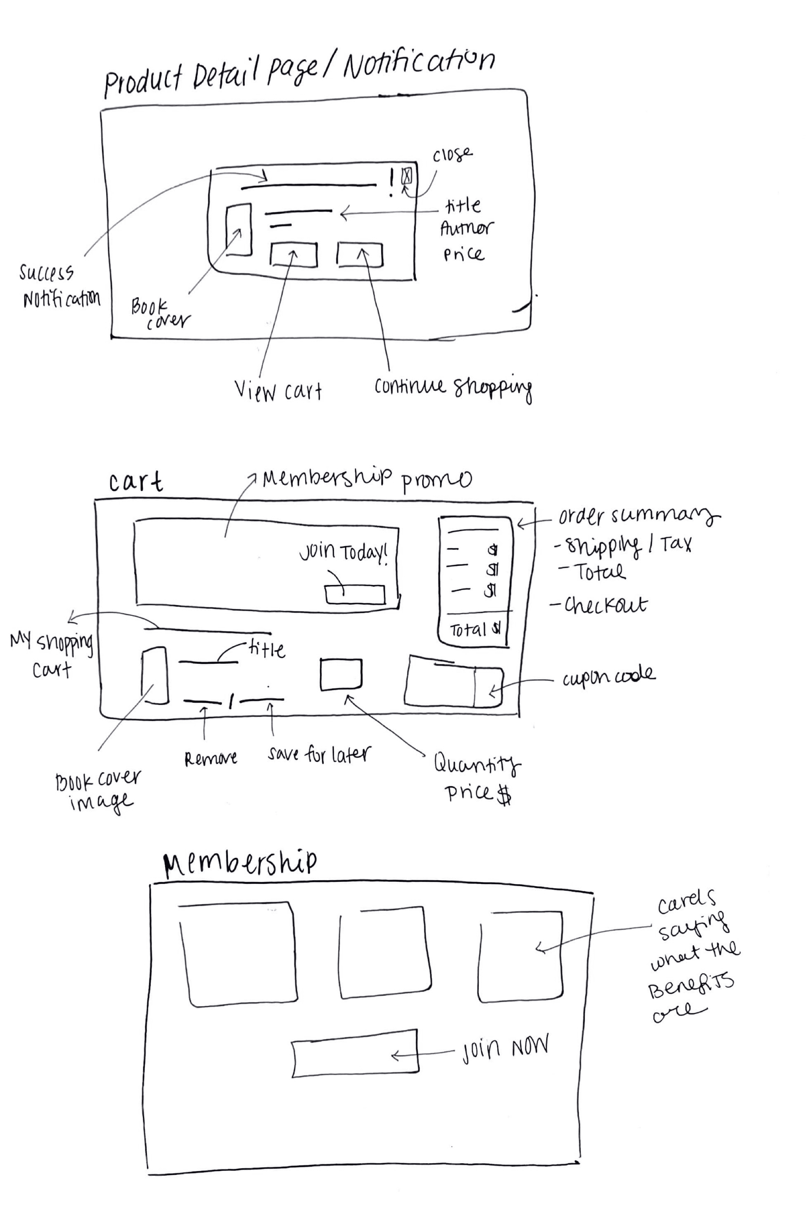
Rough Sketches
Creating rough sketches was a crucial step in the design process because it allowed me to quickly visualize my ideas and explore different possibilities without getting bogged down by details. It helps me explore different possibilities and iterate on my ideas before committing to a final design. By doing so, I can identify potential issues and make improvements early on in the design process, which can save time and resources in the long run.
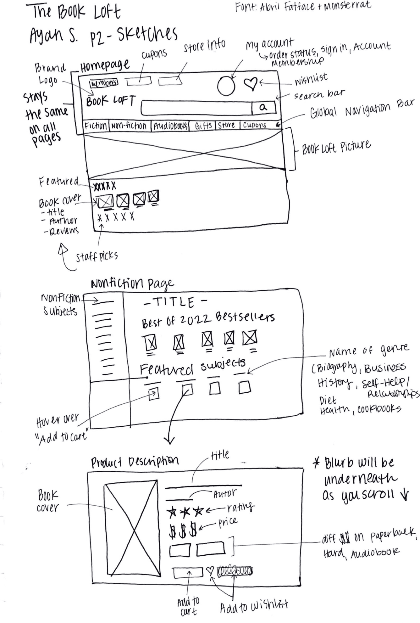
In these sketches I wanted to focus on how I wanted to lay out the navigation of the site. Depicted above is the global navigation, along with the local secondary navigation that appears under a specific genre.
Membership Program
When I was redesigning the website, I wanted to make sure that I considered both the user and the business needs. By creating a flow that benefits the business and adds value, I wanted to ensure that the redesign would be successful not just for the users but for the business as well.
I proposed a membership program which would increase customer loyalty and recurring revenue. It can also provide an opportunity to collect valuable user data for personalization and targeted marketing.
Flow: Olivia Becoming a Member

During the creation of the user flow, a crucial step was brought to my attention for the flow to be executed successfully. When the user reaches the membership page, they are presented with a decision to either proceed with the membership or not. In the event that they are not convinced, they may abandon the flow altogether. This highlights the significance of presenting the benefits of the membership using compelling UX copy and well-structured UI elements.
Branding
Color
As I considered the redesign of the website, I wanted to maintain consistency with the Book Loft's brand identity. The store's logo features a warm color palette that conveys a sense of coziness and comfort, which aligns with the experience of visiting the physical store. By incorporating these warm colors into the website redesign, I wanted to create a similar feeling of warmth and comfort for online visitors.

Typography
I wanted to ensure that the typography used in the website redesign reflected the bookstore theme. I chose Playfair Display, a serif font with a traditional and elegant feel that is commonly used in book design, to give the website a classic and refined touch.
While Noto Sans is a simple and clean sans-serif font that provides excellent legibility for the body text. By using these two fonts in combination, we can create a hierarchy and contrast that improves the readability and overall visual appeal of the website.
The Solution & Validation
Usability Testing
To test my mid-fidelity wireframes I conducted 3 usability tests along with a short follow up interview afterwards.
System Usability Scale (SUS) Score
After taking the usability test participants were asked to complete a System Usability Scale (SUS) survey. A SUS survey includes questions that ask users to rate ease of use, clarity of instructions, and overall satisfaction.
System Usability Scale (SUS) Score:
90 Excellent

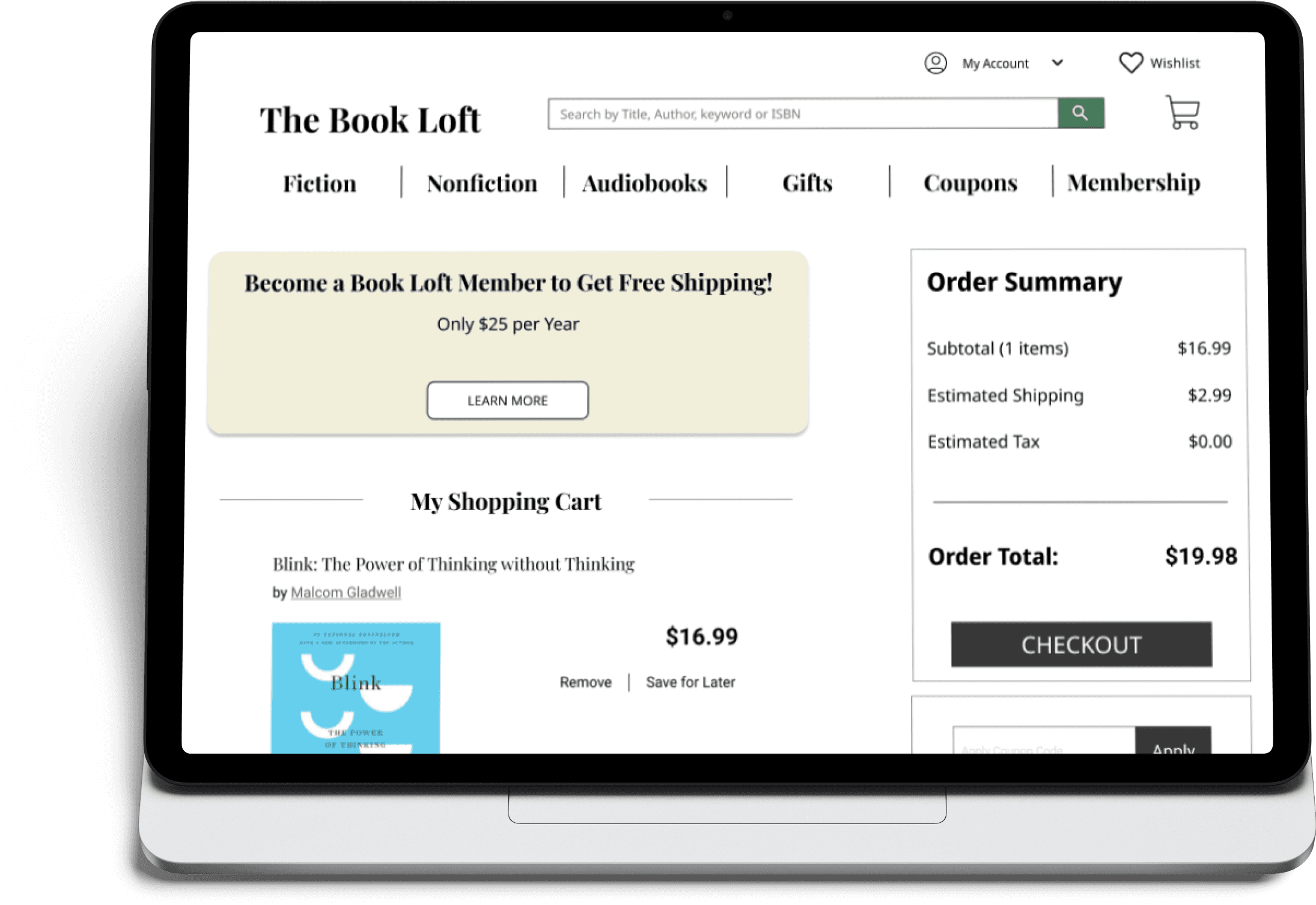
Navigation
1.Global Navigation
This enables users to access important features such as membership flow, coupons, audiobooks, and the two primary categories of books, fiction and nonfiction.
2. Local Navigation
Local navigation or “secondary navigation” has been incorporated to allow users to refine their search once they have selected a category. For instance, by clicking on non-fiction in the global navigation bar, users can now easily find their specific genre through the local navigation.
3. Contextual Navigation
Contextual navigation or "breadcrumbs" to facilitate seamless navigation across the website, enabling users to move from page to page with ease. These enhancements are aimed at improving the user experience and making it more intuitive and straightforward to explore the site's content.
Membership Promotion
As part of the redesign process, I made the strategic decision to include a promotional ad for the membership program on the checkout page. By adding this promotion on the checkout page, I would be able to capture users at a key moment in their journey. They have already made the decision to make a purchase, so they are more likely to be receptive to additional offers that can enhance their experience.
This approach not only adds value to the user but also benefits the business by increasing the likelihood of recurring revenue and customer loyalty.
Browsing
The Book Loft's UX lacked the ability to browse for books, which I addressed in my redesign. I've added a functional system that allows users to scroll through and discover books in any genre, improving the overall user experience.
Next Steps
Product Roadmap
1. Analyze User Feedback
After launching the redesigned e-commerce website, it's essential to gather feedback from users to understand how they are interacting with the site and what improvements could be made. I would use tools like surveys or usability testing to collect feedback and analyze the results to identify areas for improvement.
2. Monitor Website Analytics
Regularly monitoring website analytics can help us understand how users are interacting with the website and identify areas for improvement. I could use tools like Google Analytics to track metrics such as bounce rate, time on page, and conversion rate, and use the insights to make data-driven decisions about website design.
3. Pitch the Redesign to The Book Loft
As this was a speculative project, the next step could be to pitch the redesigned e-commerce website to Book Loft and demonstrate how it could benefit their business. This could involve presenting the research and data that informed the redesign, highlighting the improved user experience and potential increase in sales, and addressing any concerns or questions they may have.
My Learnings
1. Navigation is a top priority
Navigation is crucial in e-commerce because it can directly affect sales. A well-designed navigation system can make all the difference in how users perceive a website, find products, and complete purchases.
2. Consistency is key
Consistency in design elements, such as color, typography, and layout, is crucial to creating a cohesive and polished e-commerce website. Maintaining consistency throughout the website helps users feel more comfortable and familiar with the design, which can ultimately lead to higher conversion rates.
3. Time Management
As this was my first UX project that I completed entirely on my own, I learned the importance of managing my time effectively. I learned to set realistic goals and deadlines, break down tasks into manageable chunks, and prioritize tasks based on their importance to ensure that I stayed on track and met my deadlines.